
Rank Web Rebrand
- Client
- Rank
- Role
- Web Design
- Team
- Creative Director
3D & Motion Designer
Engineer - Timeline
- 2026
- Platform
- Web, desktop and mobile
Project Introduction
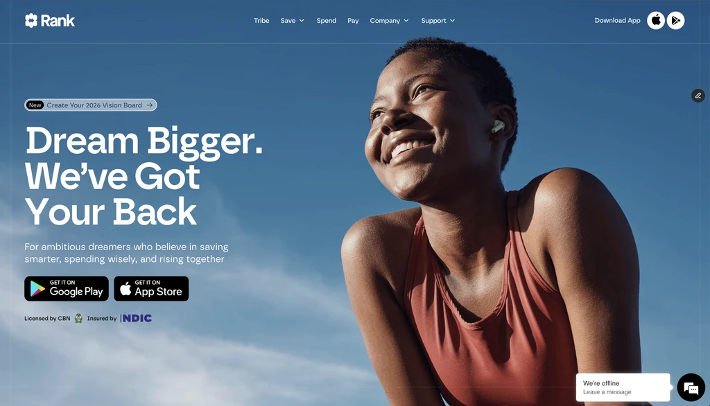
Rank needed a website that felt as ambitious as the brand it was becoming.
Rank had evolved into a broader financial platform focused on savings, access to capital, investing, and community-powered wealth building.
But the previous website did not fully communicate that scale. The new site needed to feel bold and youthful, but still clear enough for a financial brand. It had to introduce Rank as more than a money app. It had to show Rank as a platform built around community, trust, and new ways of building prosperity.
For me, the main challenge was helping translate that brand direction into actual website sections, layouts, pages, and visual systems.
The Starting Point
The old website could not carry the full story anymore.
The previous Rank website had a simpler digital presence. It worked as a product surface, but it did not fully show the larger world Rank was trying to build. The brand was becoming more expressive, more emotional, and more community-led. The website needed to reflect that shift.
The problem was that finance can easily become cold, generic, or too corporate. Rank needed the opposite. It needed to feel alive, but still trustworthy.
The design challenge became:
How do we make a financial website feel expressive, youthful, and community-powered without losing clarity?
My Role
Translating the brand direction into page designs.
I worked on the design of the site, supporting the translation of Rank’s new brand direction into web layouts and page sections.
My contribution included designing and refining website sections, applying the visual system across pages, supporting product storytelling, creating clear hierarchy, and considering how the layouts would work across desktop and mobile.
This was a collaborative project, so the final website came together through creative direction, website design, 3D/motion work, and support from the wider Rank team.
I focused on making sure the pages did not just look visually exciting, but also had a clear structure. Every section needed to guide users through the Rank story, whether they were learning about savings, Circles, Tribe, investing, community, or referrals.
Finding the Core Idea
Wealth grows through connection.
The main idea behind the site was that prosperity should not feel isolated or gated. Rank’s story was more about community, shared access, and creating better paths to wealth.
That idea shaped the design direction. Instead of making the site feel like a traditional finance platform, the website needed to feel more open, optimistic, and expressive. The visuals had to create energy, but the structure still had to guide users clearly through what Rank does.
This became the design balance:
Expressive enough to feel memorable, but structured enough to feel trustworthy.
Designing the Visual Language
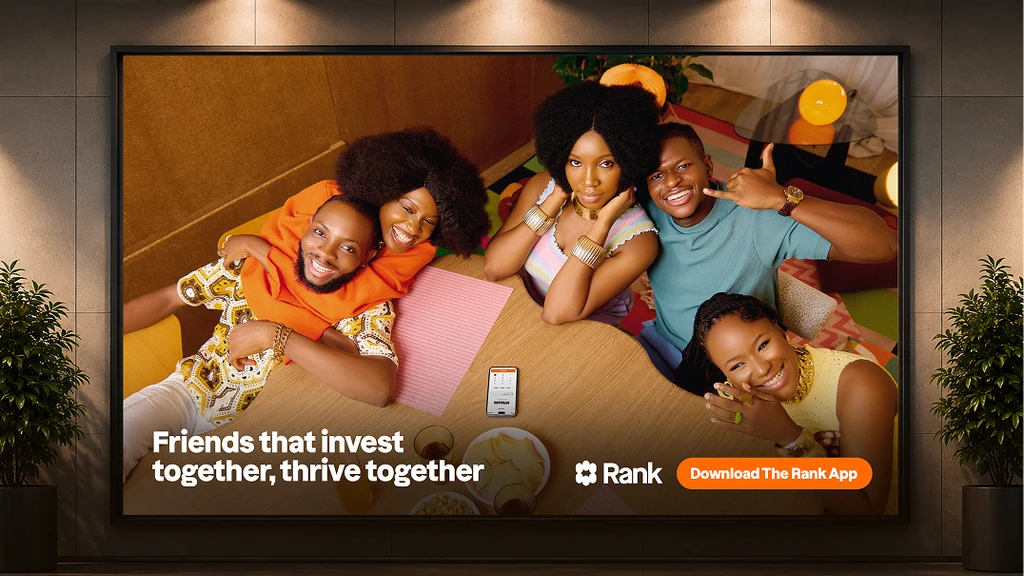
The website needed to feel alive without becoming chaotic.
One of the biggest parts of the project was making the visual language work across a real website system.
Rank’s brand had bold colors, expressive 3D assets, campaign-style visuals, and strong motion potential. But because the product is still finance-related, the design could not just be playful for the sake of it.
Color system
Color system
The palette helped define the emotional tone of the site: warm, optimistic, expressive, and full of contrast. It gave the website range, allowing different pages and moments to feel distinct while still belonging to the same world.
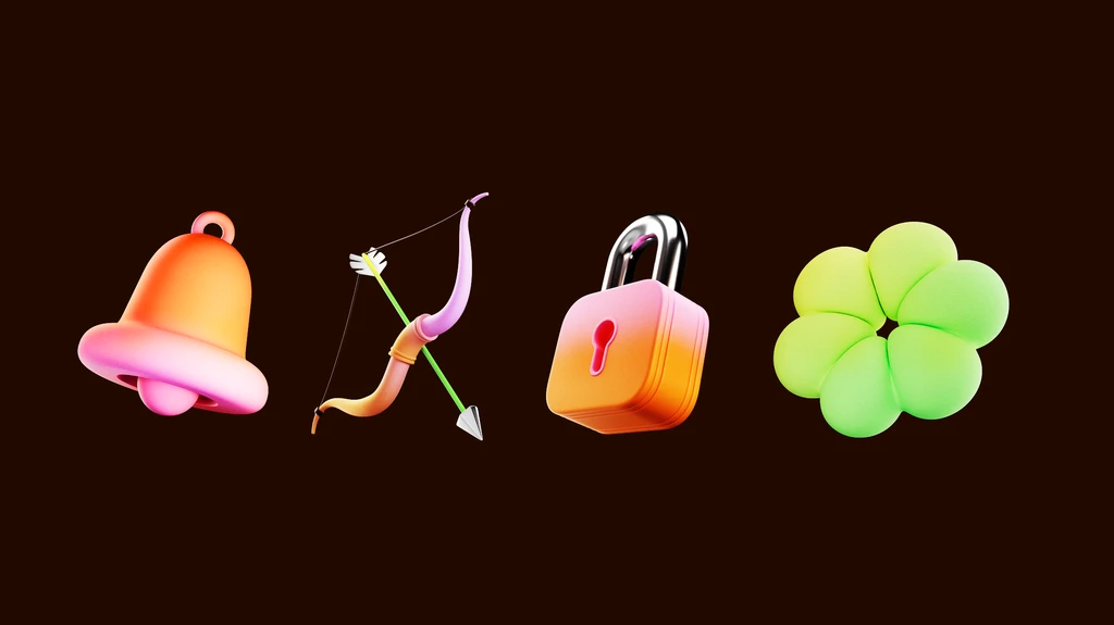
3D / illustration assets
3D / illustration assets

Building the Homepage Story
The homepage became the clearest expression of the new Rank.
The homepage had to do a lot. It needed to introduce the brand belief, explain the product ecosystem, create emotional connection, and guide users toward the right product areas.
The structure moved from brand story into product clarity:
- Introduce Rank as a money app for communities
- Establish the emotional idea behind the brand
- Guide users into Savings, Circles, Tribe, and Investing
- Show the community side of the platform
- End with a strong action point
Creating Product Worlds
Each product page needed its own personality, but the same system.
Rank had multiple product areas, and each one needed a slightly different emotional tone. Savings needed to feel structured, clear, and encouraging. Circles needed to communicate access to capital without making it feel heavy or debt-focused. Tribe needed to feel collaborative and trust-driven. Investing needed to feel guided, aspirational, and easy to understand.
Extending the Brand Beyond Product
Rank also needed to feel like a living community.
The website was not only about explaining financial tools. It also had to show the culture around Rank. Pages like Rank Community, Student Ambassador, Refer & Earn, and Community Activations helped make the brand feel more participatory. These pages made the experience feel less transactional and more connected to real people, events, and shared ambition.
Reflection
What I learned
Brand expression still needs structure.
A website can be bold, colorful, and visually rich, but it only works when the layout is clear. This project reminded me that strong visuals need strong structure behind them.
Finance does not have to feel cold.
A financial product can still feel warm, youthful, and expressive. The key is making sure the design still feels trustworthy and easy to understand.
Systems make expressive design easier to control.
Because the site had multiple pages and touchpoints, consistency mattered a lot. Reusable layouts, spacing rules, typography, and components helped the website feel connected even when each page had its own personality.
Collaboration improved the final quality.
The project worked because brand, design, motion, product, and marketing all had to connect. It showed me how important it is to design within a larger creative system, not just one screen at a time.