
RationalFX Mobile Redesign
- Client
- RationalFX
- Role
- Product Design
- Team
- 3 Engineers
1 Project Manager - Timeline
- 2023 to 2024
- Platform
- iOS & Android
Project Introduction
The app worked. It didn’t feel like it did
RationalFX helps businesses and individuals move money across borders. The app already supported the full transfer lifecycle, but downloads were flat and users I spoke to described the same feeling in different words. They weren’t sure what the app was for, and they weren’t sure they trusted it with a real payment.
For a fintech product, that uncertainty is a problem before it’s an aesthetic one. Users don’t send money from an app they don’t trust, and they don’t trust what they don’t understand.
The redesign wasn’t a visual refresh. The goal was to make the app read as a business finance tool the moment someone opens it, and to hold that trust through every screen, from account setup, through a payment, to the approval that has to happen before the money moves.
The core question
RationalFX is a global foreign exchange and international payments company helping businesses and individuals move money across borders.
RationalFX serves two audiences that behave very differently. A finance lead paying a supplier cares about which wallet the money leaves, which currency the supplier receives, the exchange rate, whether it needs approval, and having a record for the books. A personal user sending money home cares about speed and rate. The redesign committed to a business-first direction, but personal users still had to feel welcome, not like they’d walked into the wrong app.
The question I kept coming back to:
How do you make cross-border payments feel simple without stripping out the control business users need to feel safe?
The Starting Point
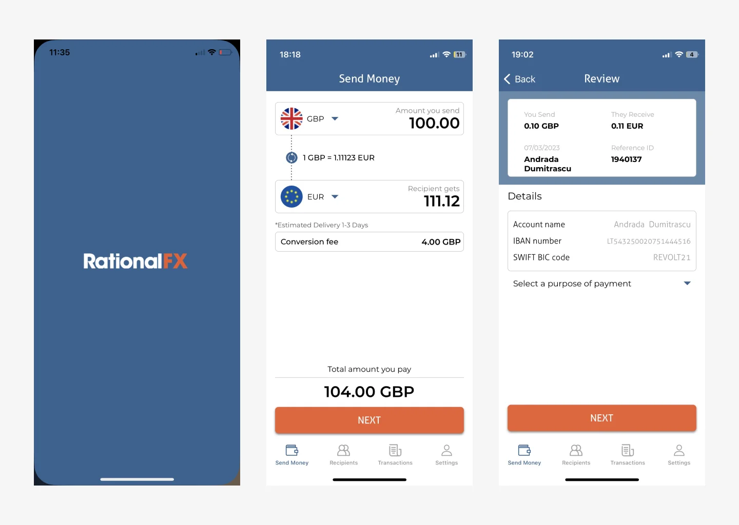
RationalFX had the right product foundation, but the mobile experience was not making the value easy enough to understand.
The main issues were:
- There was no way for a team to share one account, or for anyone to sign off a payment before it left
- Onboarding did not clearly explain the product
- Navigation felt harder than it needed to be
- The dashboard did not guide users toward key actions
- Rate and fee visibility needed to be stronger
- The transfer flow needed clearer review and confirmation moments
- Business users needed more control around recipients, receipts, and payment tracking
The goal was not just to make the app look better. The goal was to make international payments feel easier to manage and safer to complete.
Research and discovery
I reviewed competitors like Wise, Revolut, Remitly, and Lemfi to understand what users expect from modern fintech products.
The strongest products made money movement feel clear before the user confirmed anything. They showed the rate, fees, recipient details, delivery time, and transfer status in a simple way. I also reviewed the existing RationalFX app experience and looked for usability issues around navigation, onboarding, hierarchy, trust, and payment flow.
Three insights shaped the direction:
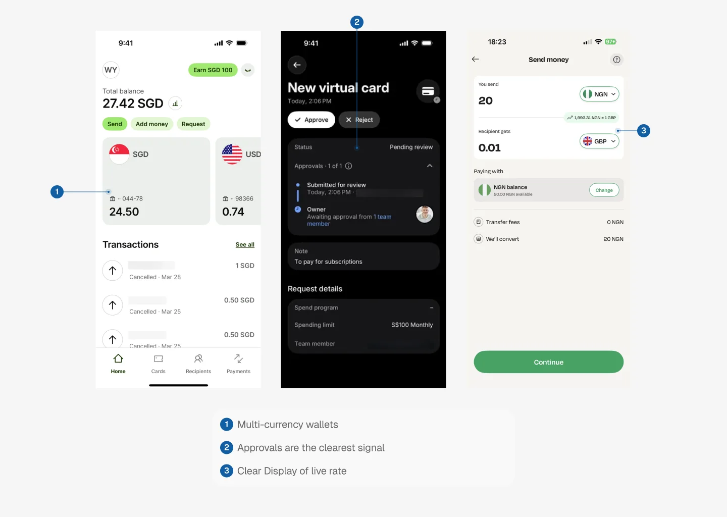
Multi-currency wallets aren’t a feature. They’re the architecture.
Wise’s biggest unlock isn’t the transfer, it’s giving each user a real local account number in each currency they hold. A UK customer can pay a Nigerian business in GBP without an international transfer. Adopting this pattern shifted the whole information architecture from “transfer as a one-off action” to “wallets as containers, transfer as an activity.”
Approvals are the clearest signal a fintech is built for business.
Revolut Business treats approvals as a first-class primitive, with rules, roles and approval steps. Wise recently moved from roles to per-user permission sets. Both make the app feel like a finance tool, not a consumer wallet. RationalFX had no approval concept at all, which was leaving B2B trust on the table.
Trust is built on the amount screen, not the confirmation screen.
Wise and Revolut both surface You send / Recipient gets / Rate / Fee / Delivery time on the same screen the user types the amount into. Products that hide fees until the final step feel like they’re trying to sneak something past you.
The insight underneath all three:
Every screen in a payments app is either reducing uncertainty or adding to it.
Seeing through Ada’s lens
The primary user is a business paying suppliers across borders.
Meet Ada, the finance lead at a 20-person import business. Every month she pays suppliers in GBP, USD and EUR, and any payment over £1,000 needs her managing director’s sign-off before it leaves the account.
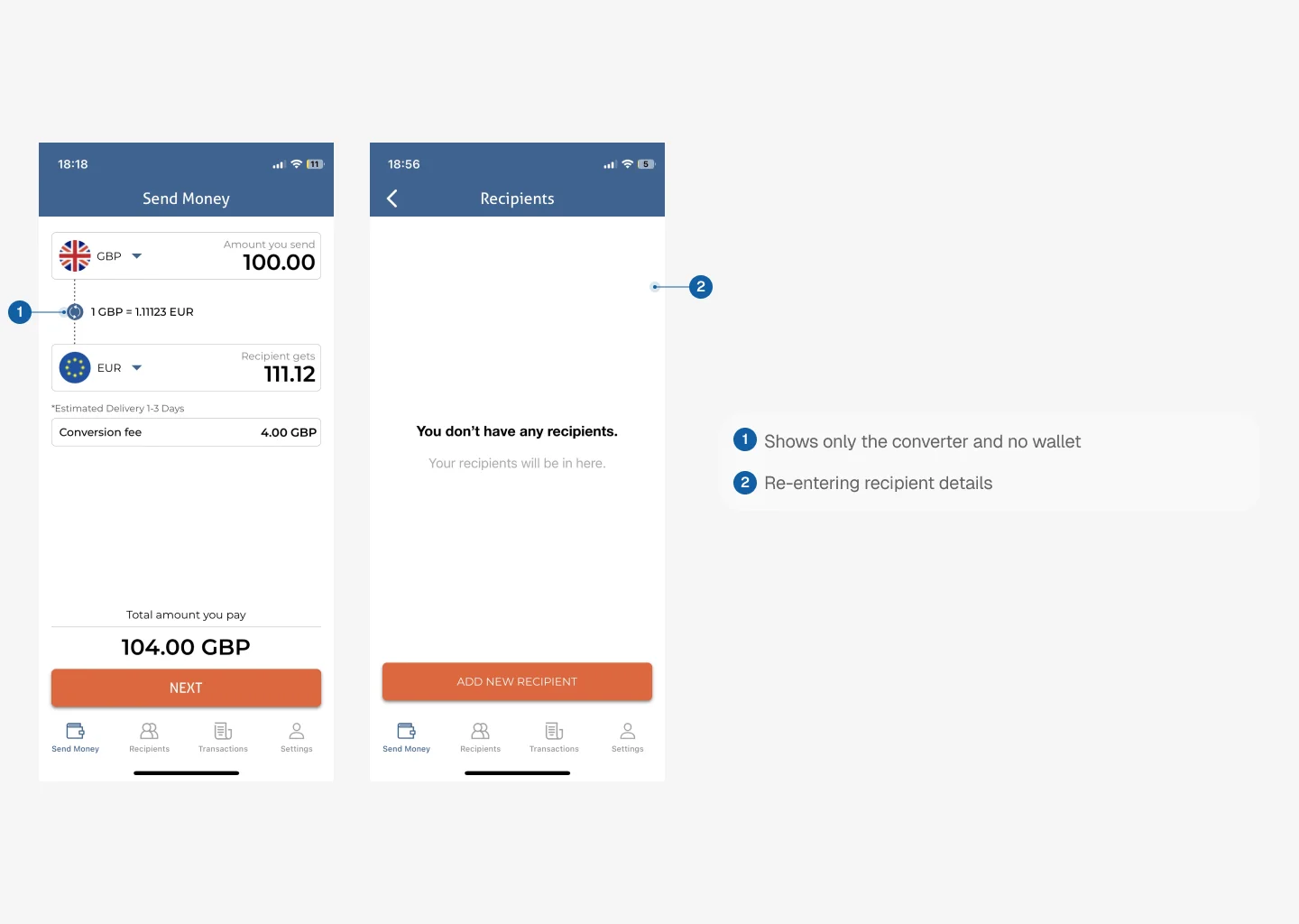
In the old app, that sign-off happened outside the product, over email and chat. The team couldn’t share the account, so every payment ran through one login. Supplier bank details had to be entered again each time, and there was no clean record to hand to the bookkeeper at the end of the month.
Ada is a composite persona that represents RationalFX’s business customers. She shaped most of the decisions in this redesign, from wallets and recipients to team roles and approvals.
Seeing through Matt’s lens
The personal side still had to feel effortless.
Matt represents the personal side of RationalFX. It’s a smaller audience, but one the business-first app still had to serve well.
Meet Matt, a young professional who recently moved abroad for work. Every month, he uses RationalFX to send part of his salary back home to support his family. RationalFX had always been reliable on desktop, so when Matt discovered they had a mobile app, he downloaded it expecting the same smooth experience.
Within minutes frustration set in:
“I wasn’t sure if I’d actually sent the money… or if I just lost it.”
He wasn’t sure where to start. The navigation felt confusing, and the layout didn’t guide him toward his next step. When he finally managed to set up a transfer, there was no clear confirmation that it had gone through. He refreshed the page, checked his inbox, and waited, but nothing came. For someone moving their hard-earned money across borders, that kind of uncertainty was unsettling.

“When users try to find out their current balance, they have to call in and to talk to our team”
Matt’s frustration was echoed by other users as well:
- Onboarding felt clunky and confusing.
- Navigation required too many steps for basic actions.
- Feedback was inconsistent, leaving users uncertain.
- And without a wallet feature, users didn’t know their account balance and they had to re-enter details every single time.
One user said:
“I hate re-entering my details every time I need to send money to the same person. Why can’t it just remember me?”
Another said:
“Sometimes I don’t know if my transfer worked. I just wait and hope, or sometimes I have to make calls to RationalFX to find out if my money has been sent.”
New app structure
Before designing screens, I restructured the app around the main jobs users needed to complete.
Onboarding
The setup is the sales pitch
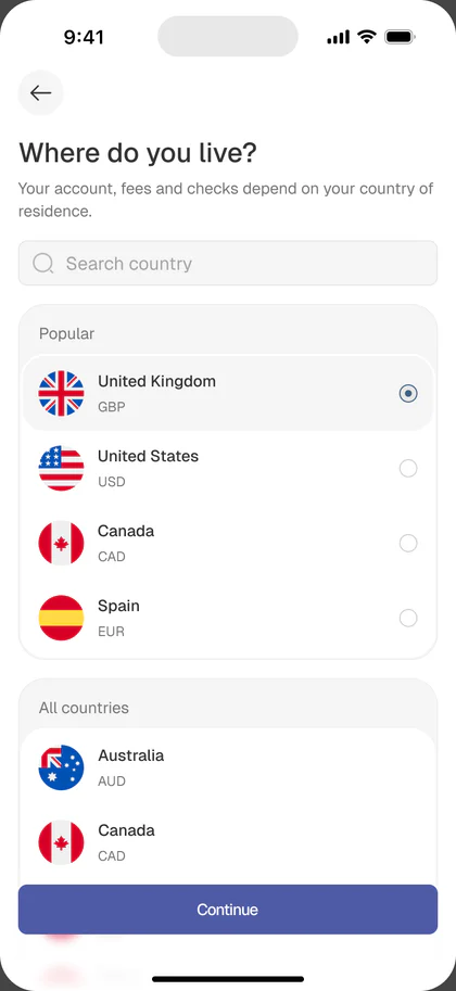
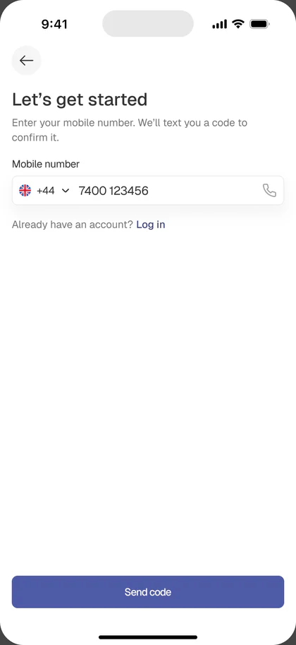
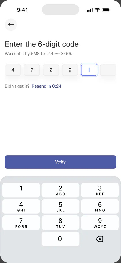
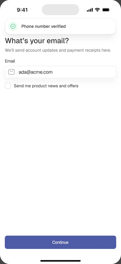
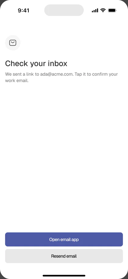
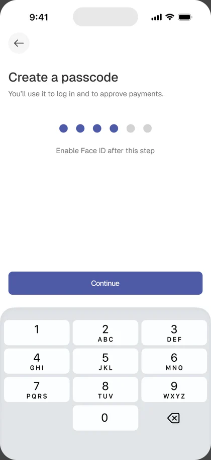
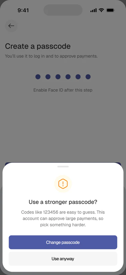
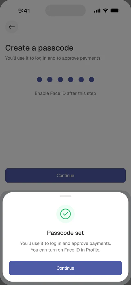
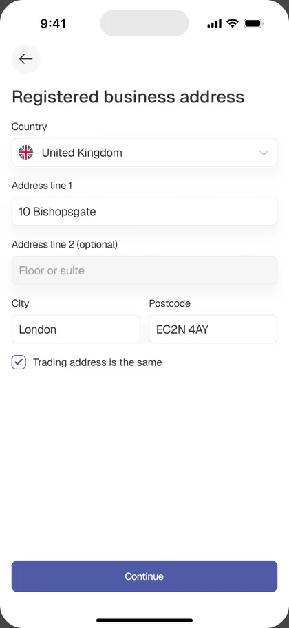
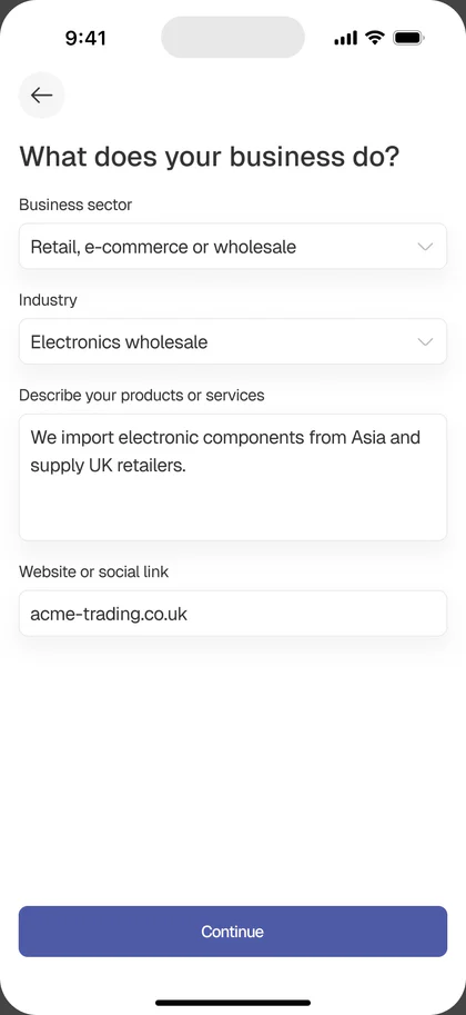
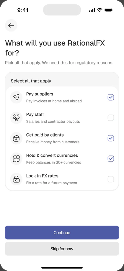
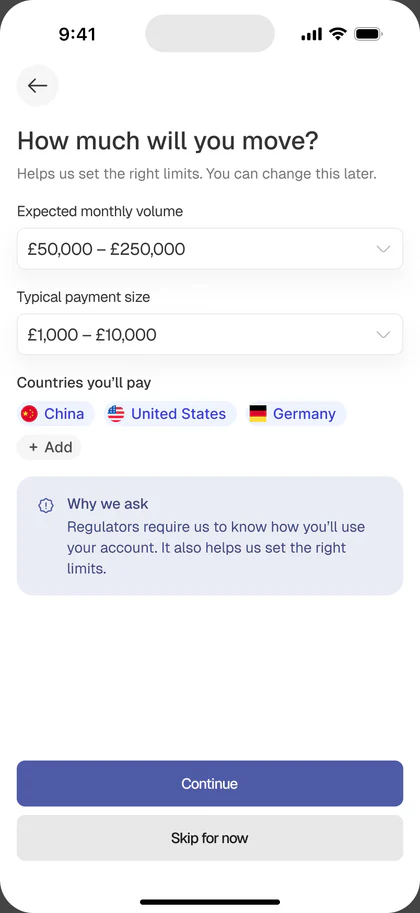
The old onboarding was three brand screens. The new onboarding does something the whole app depends on: it establishes who the user is, what type of account they need, and what they can do inside the app.
Phase 1, sign up (required):
Phase 2, about you:
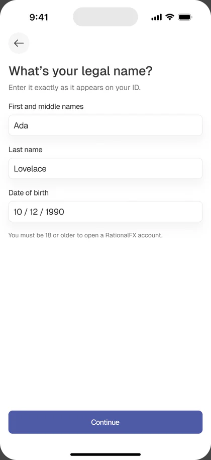
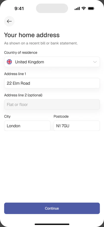
Phase 3, your business:
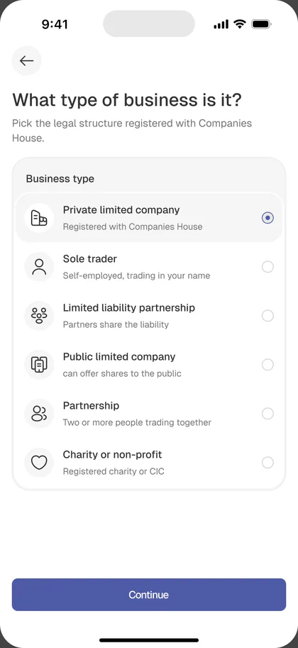
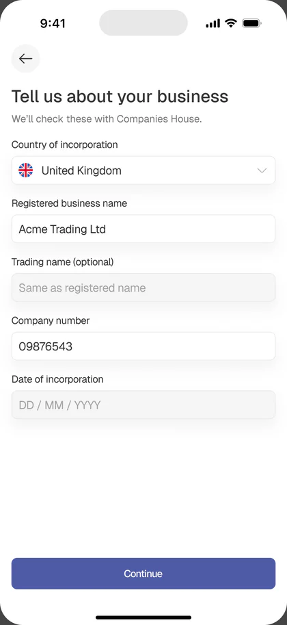
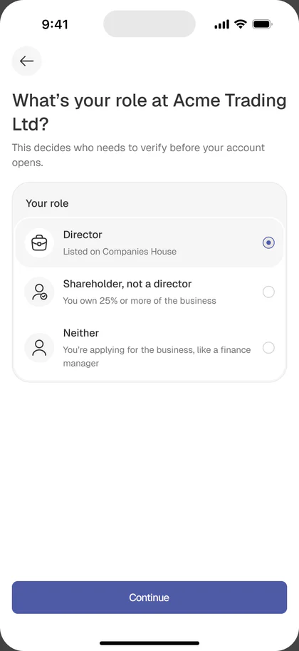
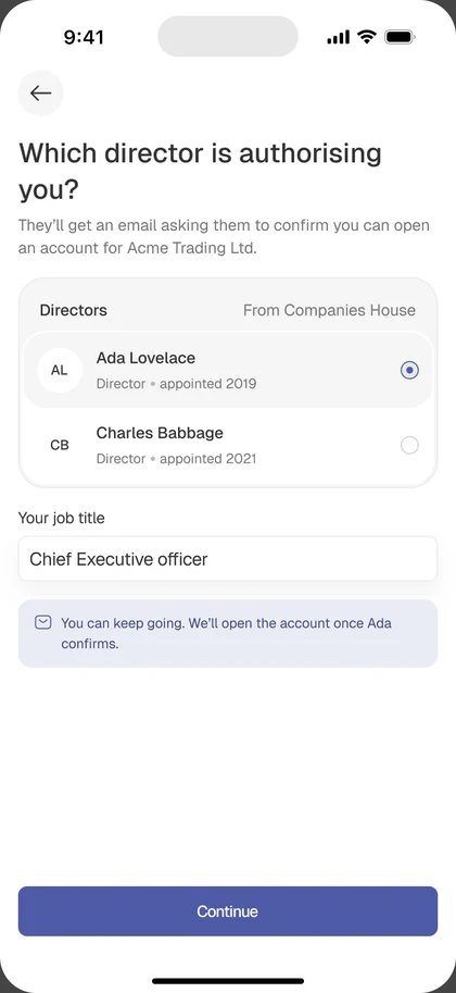
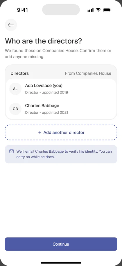
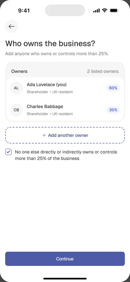
Phase 4, verify and submit:
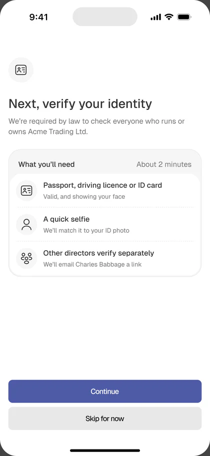
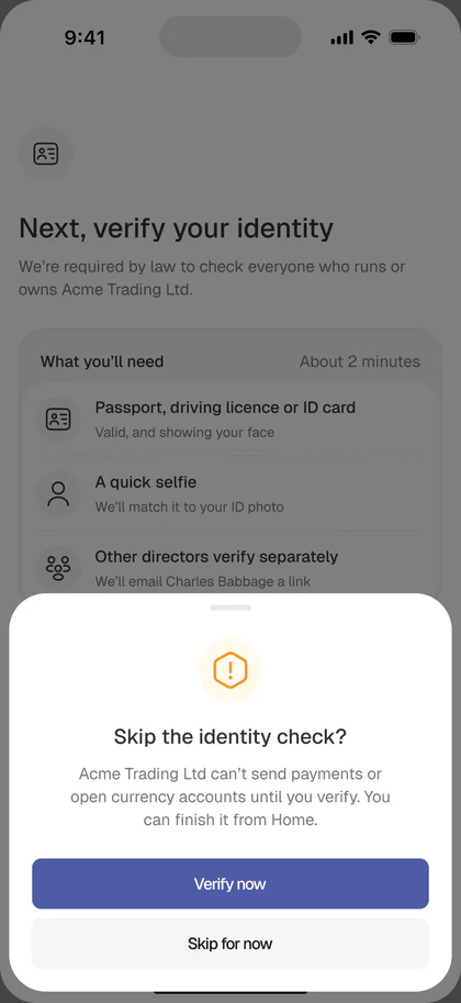
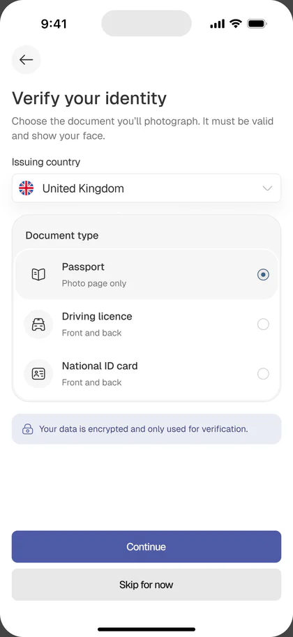
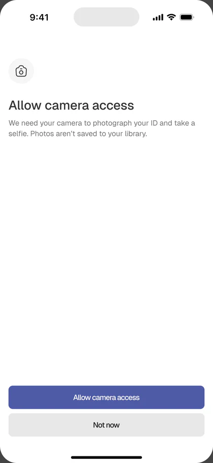
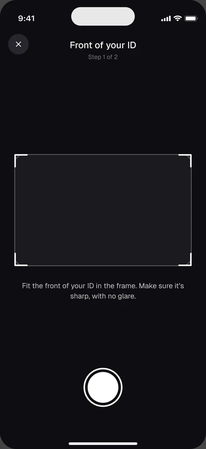
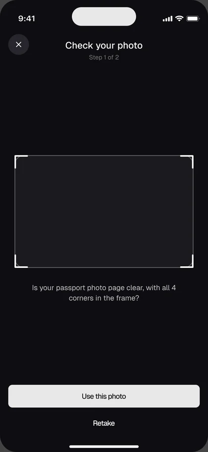
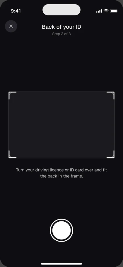

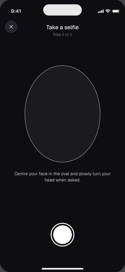
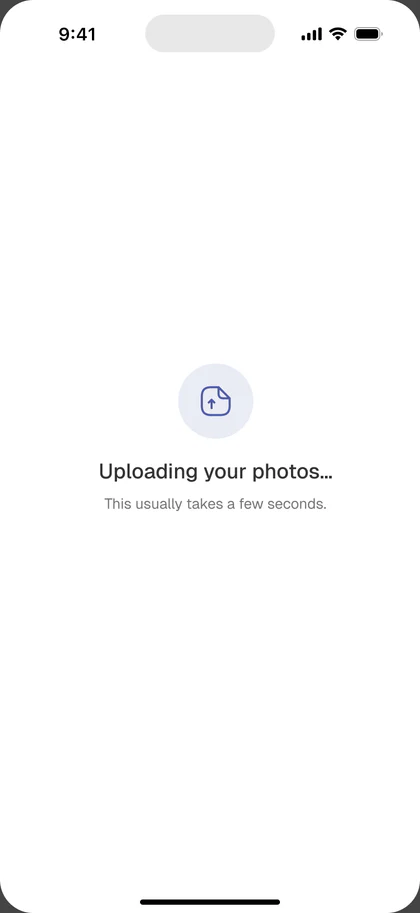
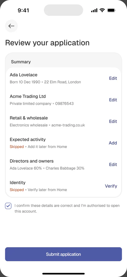
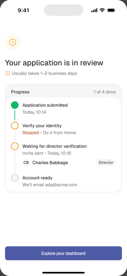
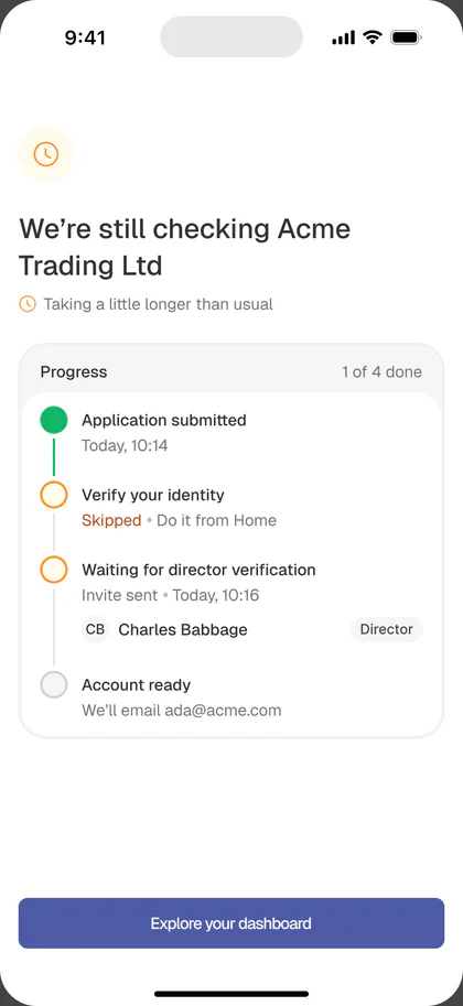
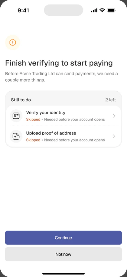
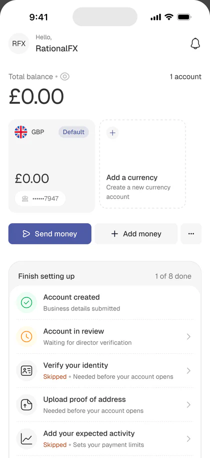
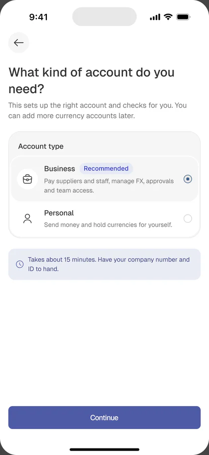
The account type screen at step 2 is the single moment where the B2B/B2C tension resolves in product. Everything else flows from it, including which entries appear in Profile, which primitives show up in navigation, and which permissions surface exists at all.
That one answer shapes the whole app:
- Business account: KYB verification, team and roles, approval rules, a business profile, and recipients tagged Business or Individual
- Personal account: an identity check only, no team or approval steps, and a lighter profile, with the same wallets, rates and send flow
Business users get the controls they need, and personal users get the same speed and clarity without any of the business setup in their way. This made the app feel more like a business payment control center instead of a generic transfer app.
The result: revamping the onboarding flow contributed to a 33% increase in onboarding completion, driven by clearer navigation, one-question-per-screen form structure, and simplified interactions that reduced drop-off at the KYB step.
Internal structure
Restructuring the app around the payment lifecycle
The old IA was organized around features. The new one is organized around the shape of a payment.
- Home: wallets, quick actions, activity
- Send: the transfer flow
- Recipients: who you pay
- Rates: what you’re waiting for
- Profile: you, your business, your team
Nothing novel about this navigation, and that’s the point. Business users don’t want an inventive nav. They want the primitives online banking already taught them.
Home / Dashboard
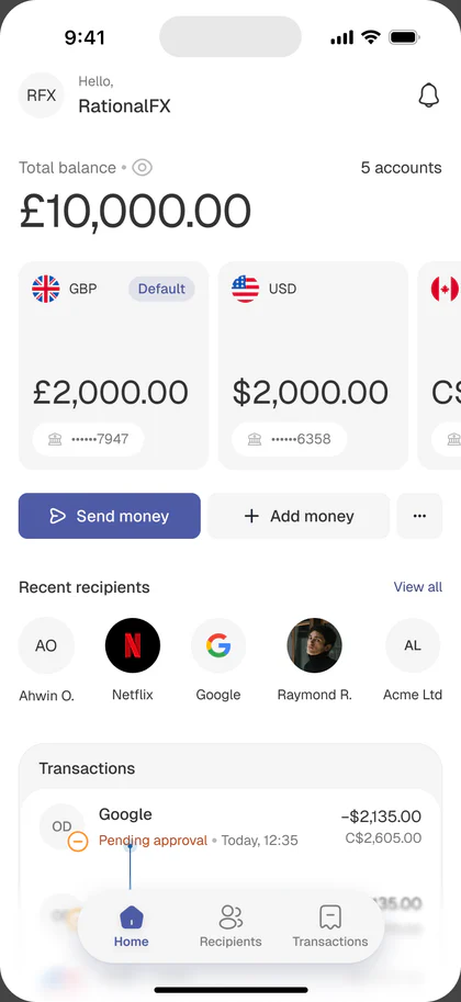
A wallet first control center
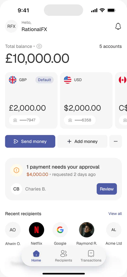
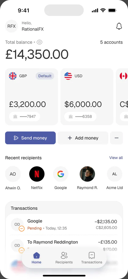
The home screen had to answer three questions at a glance: how much is in each currency, what needs my attention, and what can I do next.
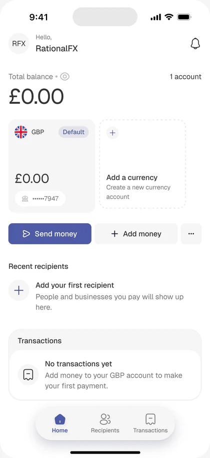
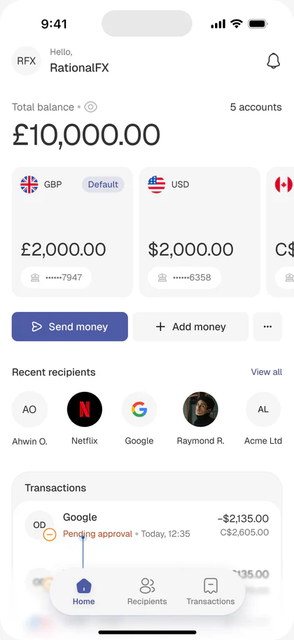
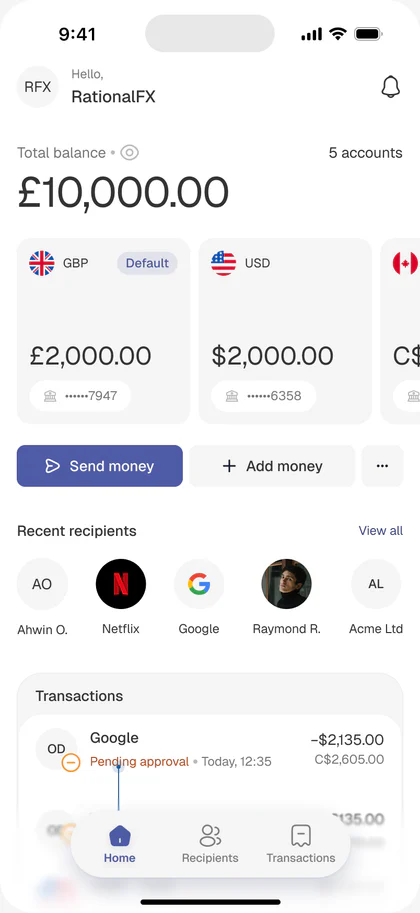
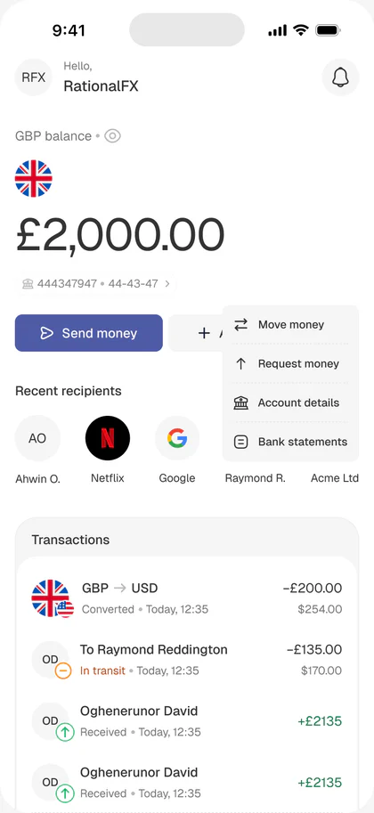
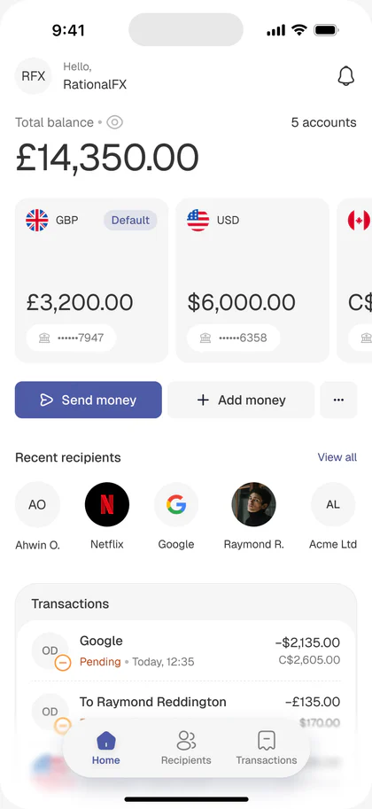
The old home was just a page with a converter and send money button. The new home is a wallet gallery:
- A small header showing total balance as a labelled USD equivalent estimate
- A horizontally scrolling row of wallet cards, each with flag, balance, and an account number hint
- The primary wallet carries a Default pill so users know which one Send Money will draw from
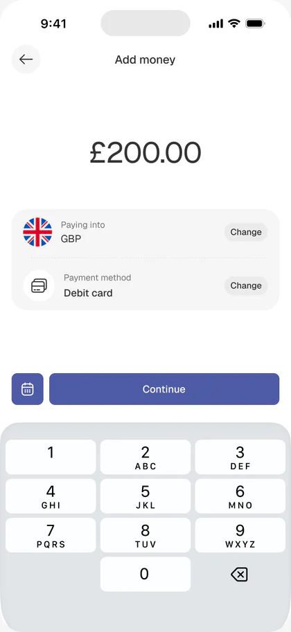
- Send Money and Add Money as the two main actions, with a caption reminding the user which wallet they’re about to send from
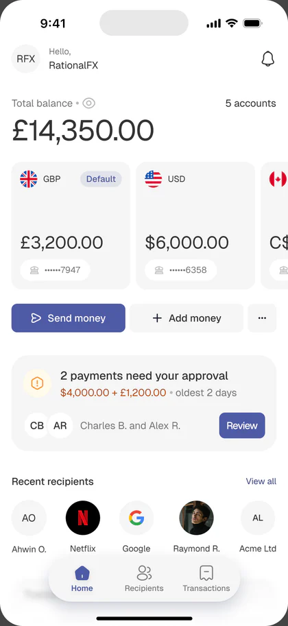
- Pending approval: a band that appears when the user has payments awaiting their sign-off. It’s the highest-priority thing on the screen when it’s there
- Recent recipients: one tap into a repeat payment
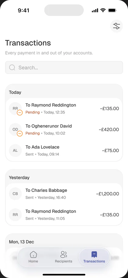
- Transactions with status pills (Pending, Completed, Received)
The subtle but consequential change is where the emphasis lives. The old dashboard emphasized how much money you have. The new one emphasizes what currency it’s in, what needs your attention, and what you can do with it next.
The Wallet
The wallet becomes the primitive
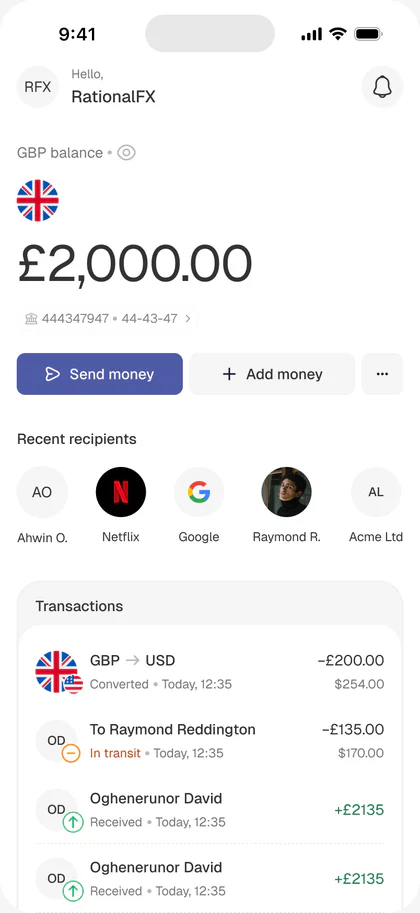
The biggest architectural change: replacing “the block rate convertor” with “you have wallets.”
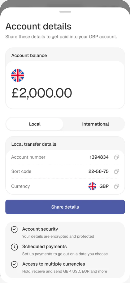
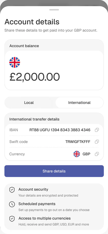
Each wallet is a first-class object:
- Its own balance
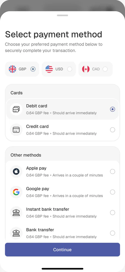
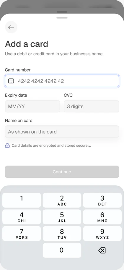
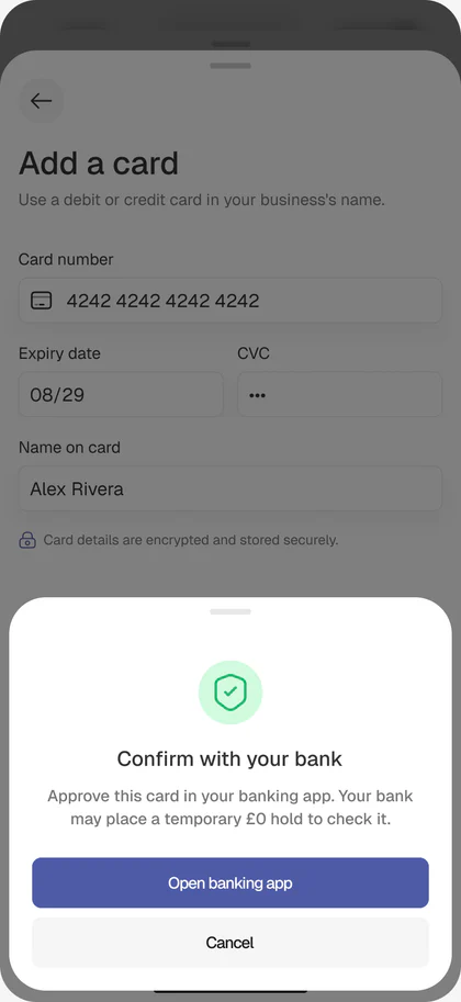
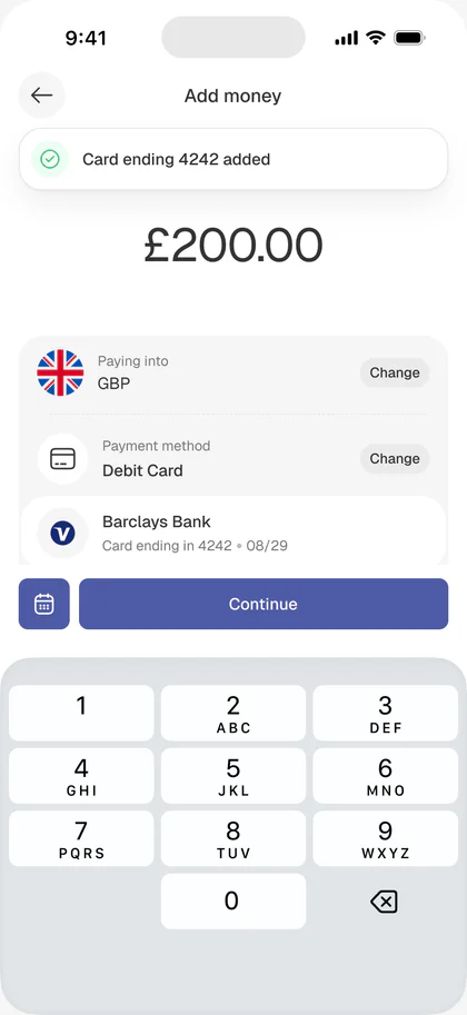
- Its own local account details (sort code + account number for GBP, routing + account for USD, IBAN + SWIFT for EUR) so customers can pay in as a domestic transfer
- Its own international details for cross-border receiving
- Its own transaction history
- The ability to send from it and convert between other wallets
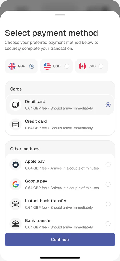
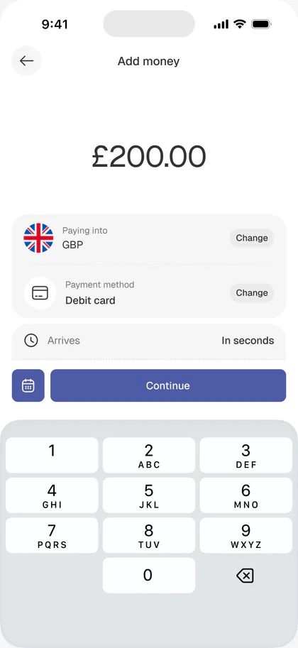
This changes almost every downstream screen. The home lists wallets. The send flow starts by picking a source wallet. Recipients get paid into one of their wallets. Activity is filterable by wallet.
Send payment flow
Where trust is built or lost
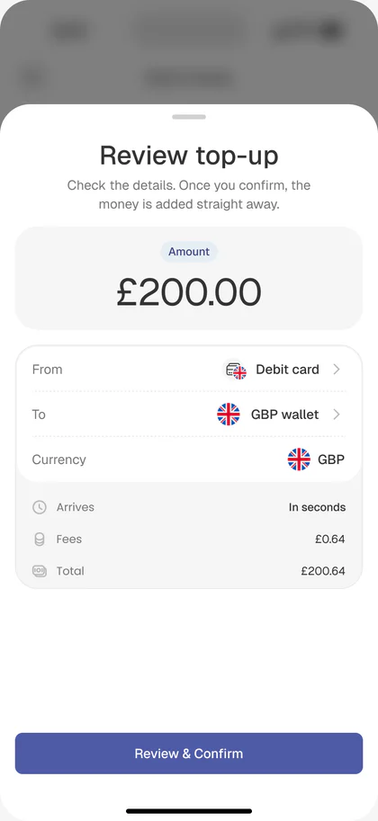
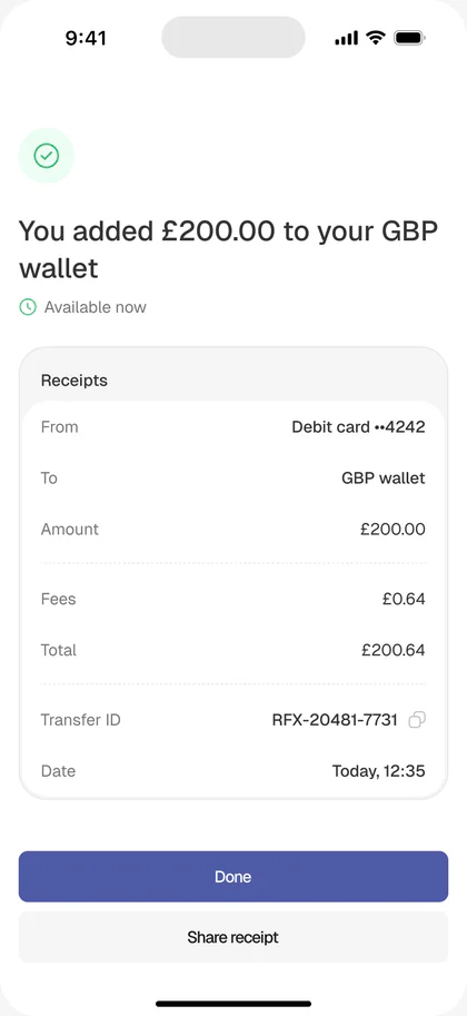
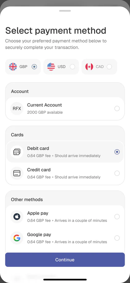
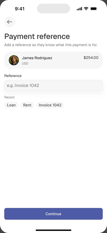
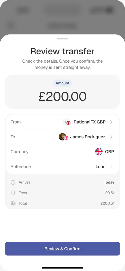
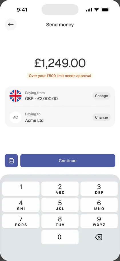
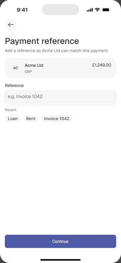
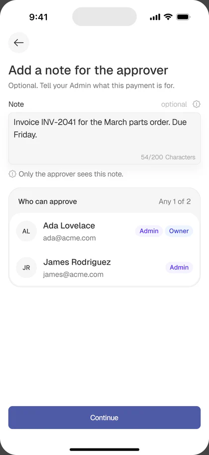
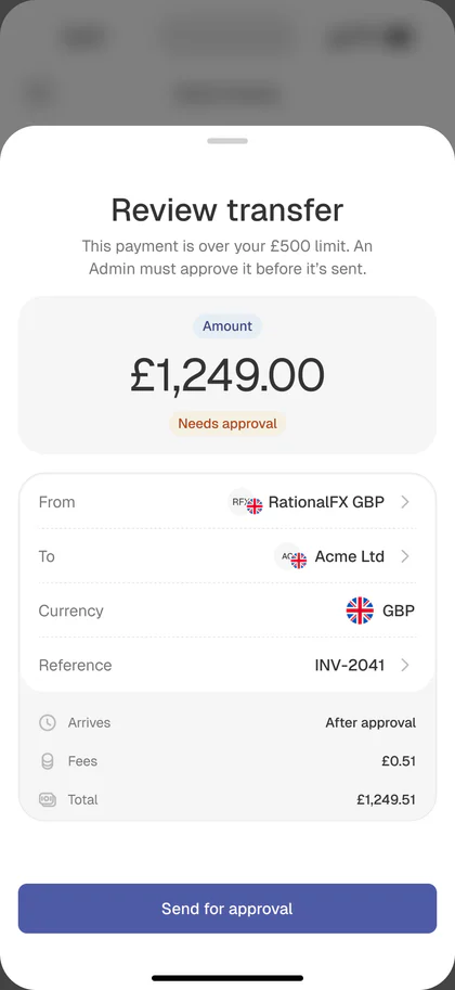
Most send flows look like six equally-weighted steps. In practice, two screens carry all the trust: the amount screen and the review screen.
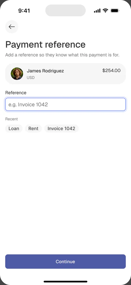
The flow mirrors Send Money’s grammar so users don’t learn a new pattern:
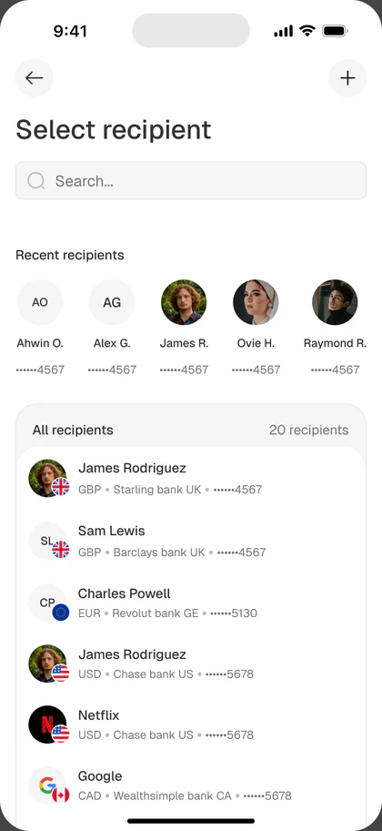
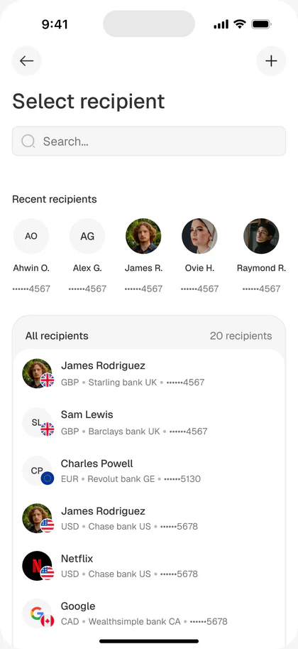
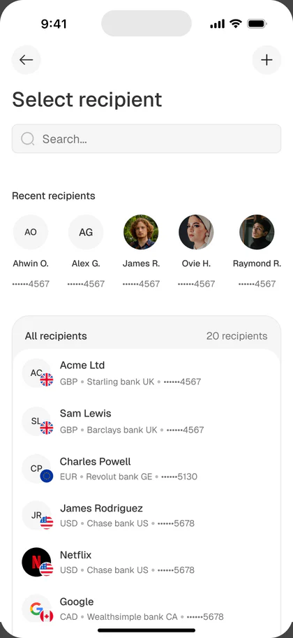
- Select recipient
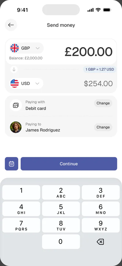
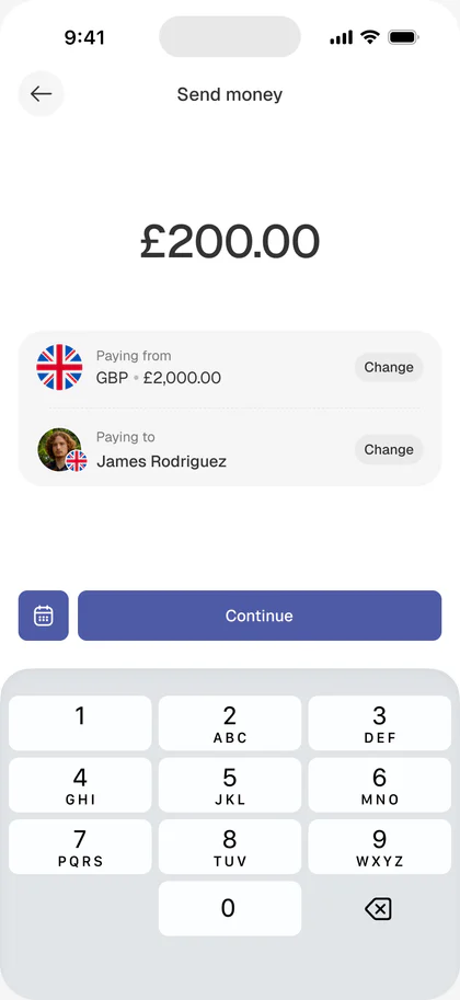
- Enter amount: with rate, fee, and delivery time inline
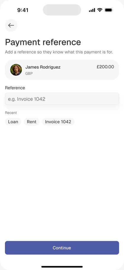
- Add a reference (invoice number, note)
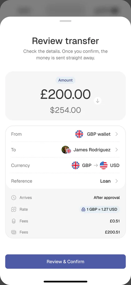
- Confirm: everything, together, on one screen
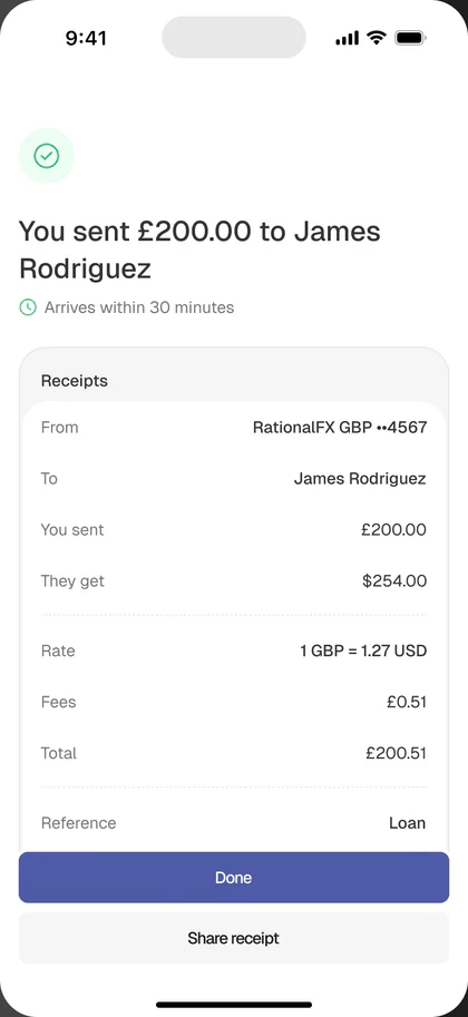
- If it crosses the approval threshold → “Awaiting approval” state instead of “Sent”
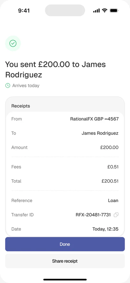
- Track: a status timeline until the recipient receives it
The amount screen shows You send in the sender’s currency and Recipient receives in theirs, with a live exchange rate and fee between them. Users can type in either field and the other back-calculates. This is a small change that answers the biggest question business users ask: how much will they actually get?
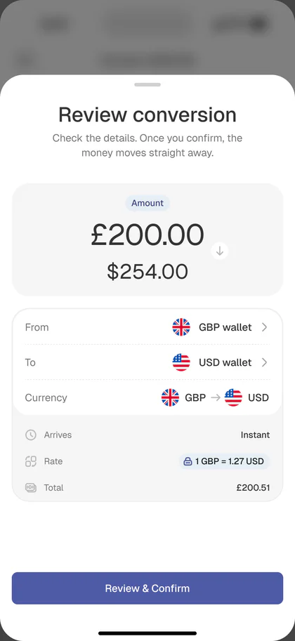
The review screen is the emotional peak. It shows, in this order: who is being paid, how much they receive in their currency (bold, large), what it costs in the sender’s currency, when it arrives, and the rate, locked for 30 seconds. Every other row is subordinate to those five.
The reason for this order came from watching how people describe payments to each other. Nobody says “I sent 200 GBP at 1.27 with a £0.51 fee.” They say “I paid James $254, it should land today.” The screen is written in that grammar.
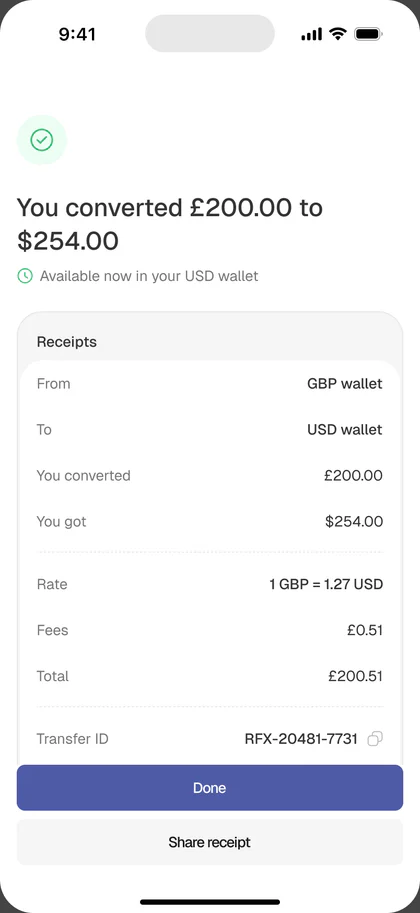
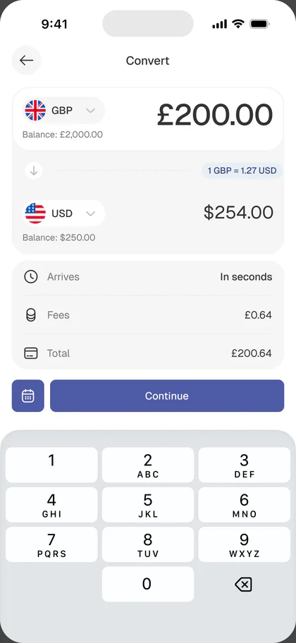
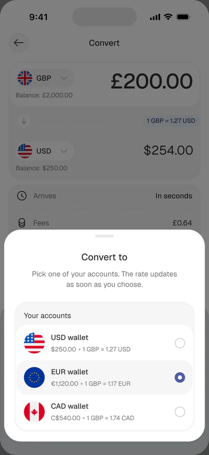
Convert money
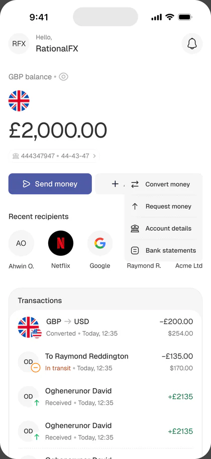
Moving money between your own wallets
Holding multiple currencies is only useful if you can move between them on your own terms. Convert is the second reason multi-wallet exists (receiving in local currency is the first).
The flow mirrors Send Money’s grammar so users don’t learn a new pattern:
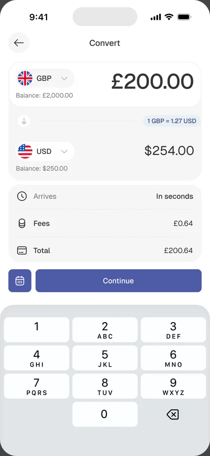
- From wallet: source currency, balance shown
- To wallet: destination currency
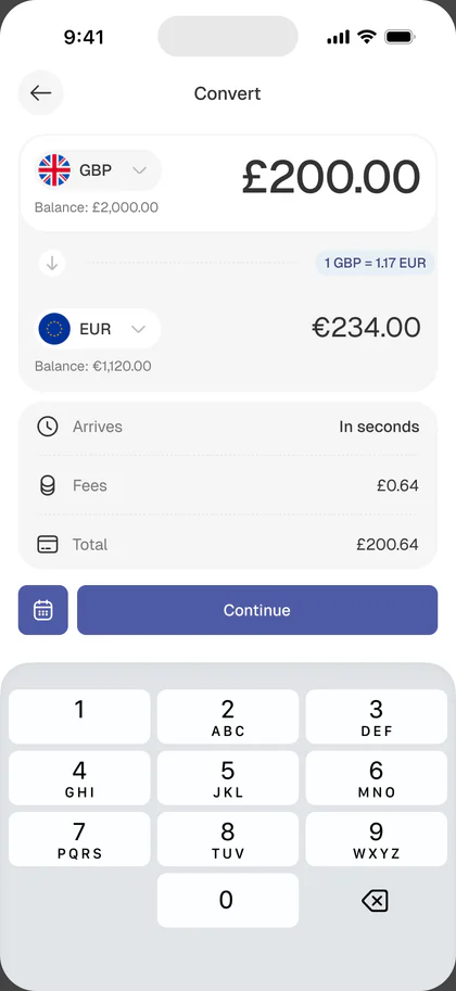
- Amount: typeable in either currency, with the other back-calculating
- Rate + fee inline: the same live rate panel as the send flow, so the user sees exactly what they’ll receive before confirming
- Confirm: locked rate with a short countdown, then the destination wallet updates instantly
The key decision was making Convert feel lighter than Send. A transfer leaves the account and needs review moments, an approval, a recipient. A conversion stays inside the user’s own money, so it’s a single screen with a swap control between the two wallets, no recipient step, no approval gate. Same rate component, fewer steps.
For a business, this is treasury management in the palm of their hand: hold GBP, convert to USD when the rate is favorable, pay a US supplier from the USD wallet, all without an external FX broker.
Rates and fees
One of the biggest improvements was making rates and fees visible earlier.
Users should not have to reach the final screen before understanding the cost of a transfer.
This helps users compare, understand, and make a confident decision before moving forward. For business users, this is especially important because payment amounts may be larger and exchange-rate changes can matter more.
Team, roles, and approvals
The B2B differentiator
The strongest opportunity in the redesign, and the feature that turns RationalFX from “a nicer transfer app” into a proper business finance tool.
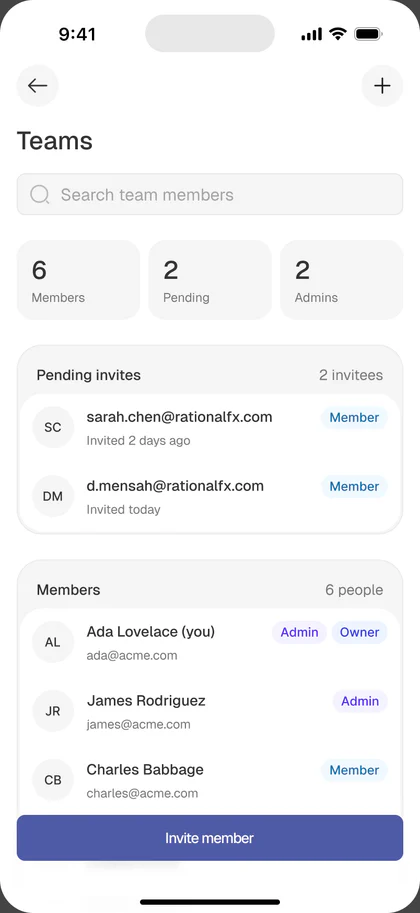
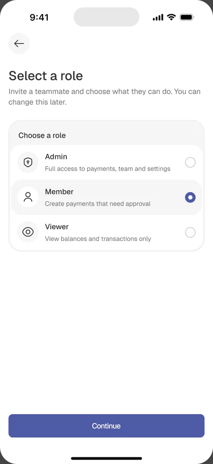
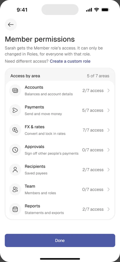
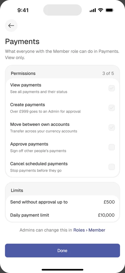
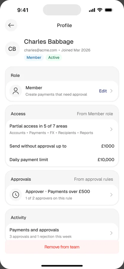
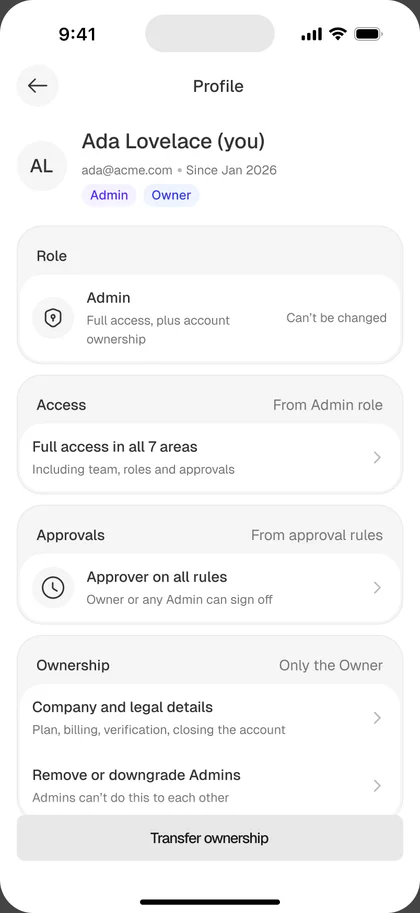
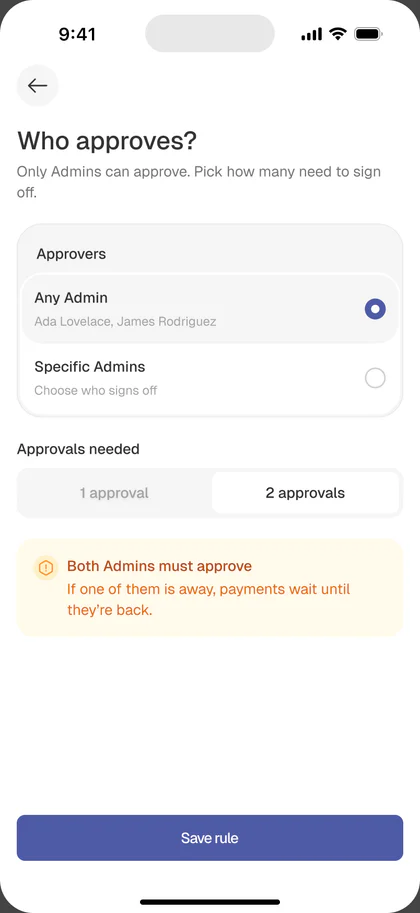
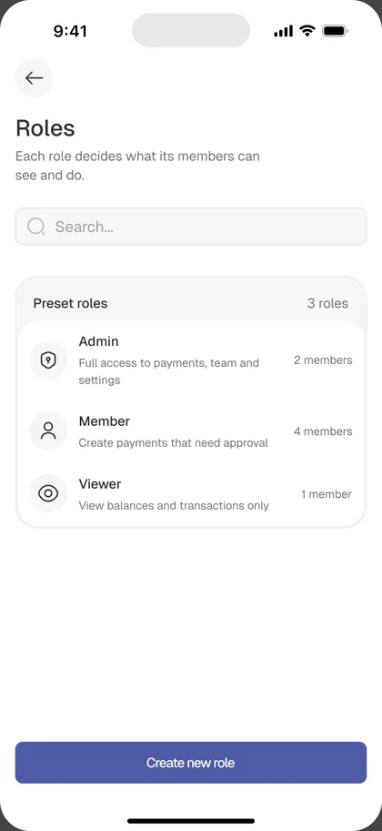
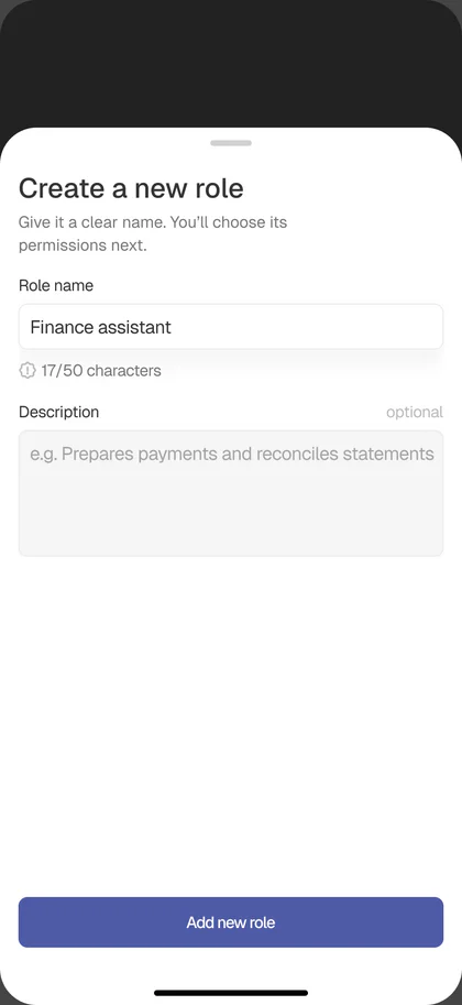
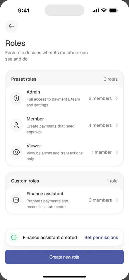
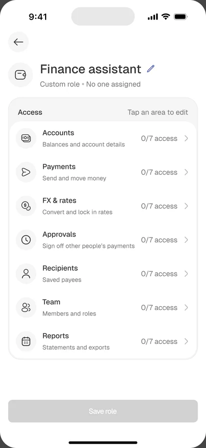
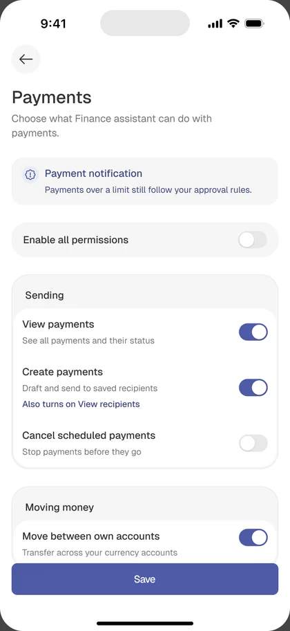
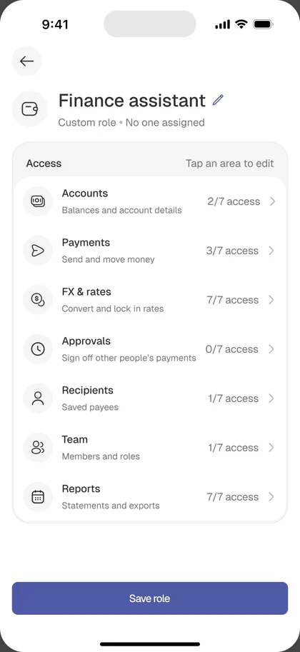
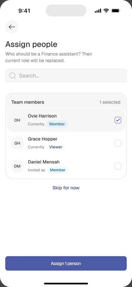
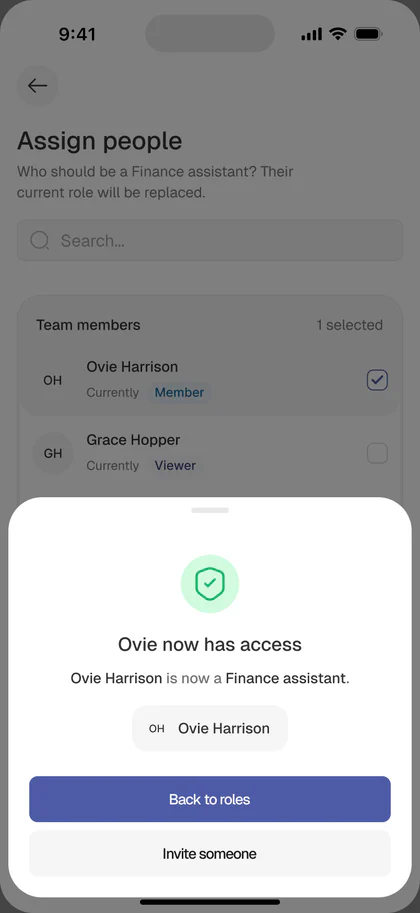
Team + roles. Four preset roles cover what most small businesses need:
- Owner: full access, cannot be revoked, one per account
- Admin: everything except billing and ownership transfer
- Member: can create payments (needs approval per rules), manage recipients, view rates
- Viewer: read-only across the app
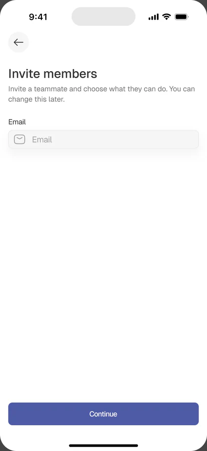
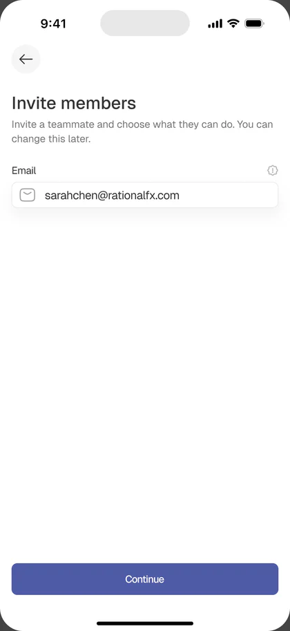
Each role is a tappable card in the invite flow, with an expand chevron that reveals the exact permission matrix. The pattern is modeled on Revolut Business, scoped down to presets in v1 (custom roles land later).
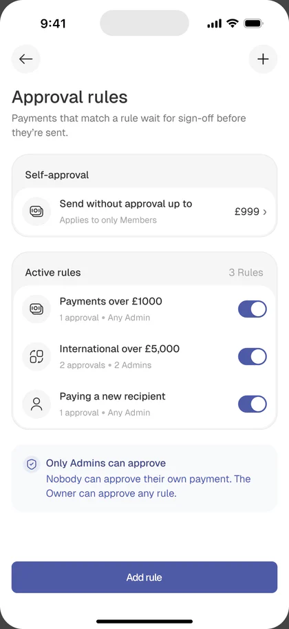
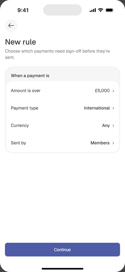
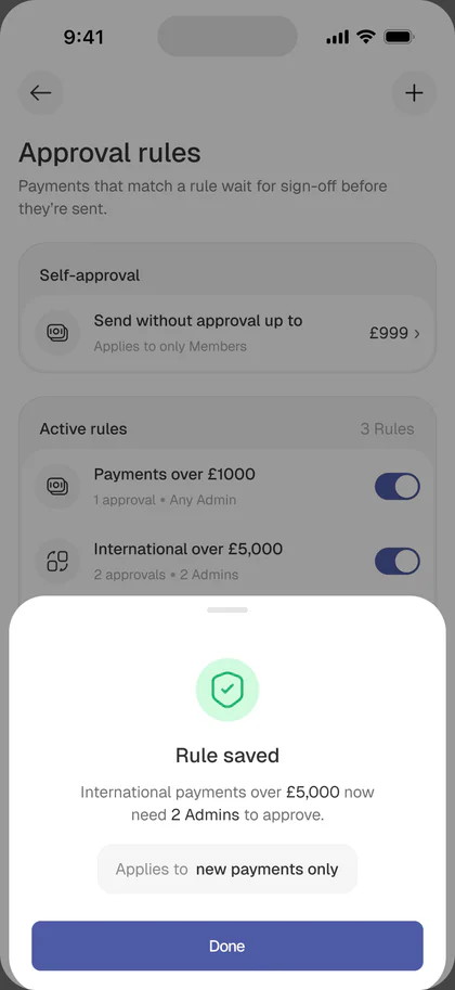
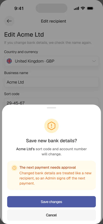
Approval rules. One rule, one threshold, one approver. Three fields on a single screen:
- When a payment is over: number input with currency
- It needs approval from: dropdown of Owner/Admin roles
- This applies to: all team members or specific members
A live preview card at the bottom updates as the user types:
“Payments over £1,000 created by any team member will need approval from you (Ahwin David) before sending.”
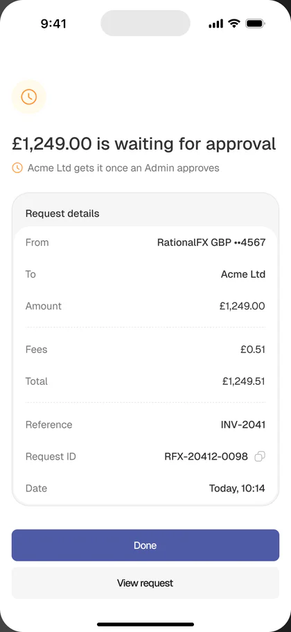
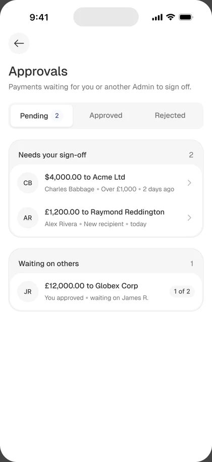
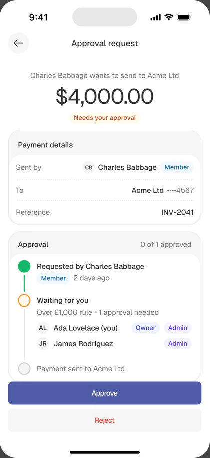
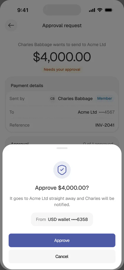
The approval loop. When a Member creates a payment above the threshold, it enters Awaiting approval instead of sending. The Owner gets a push notification and a Pending band at the top of the dashboard. The approval detail screen shows amount, recipient, rate, fee, reference, creator, timestamp, and two buttons: Approve or Request changes. Every payment in Activity shows an approval trail.

Recipient management
Designed for repeat business payments
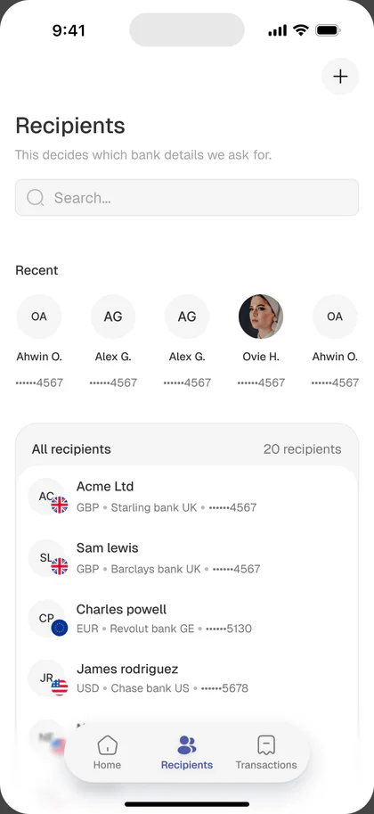
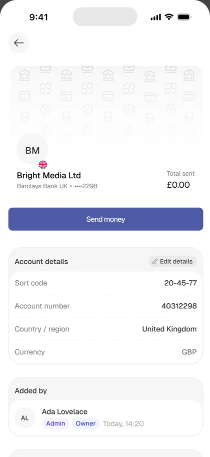
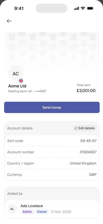
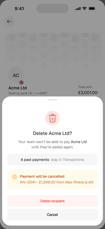
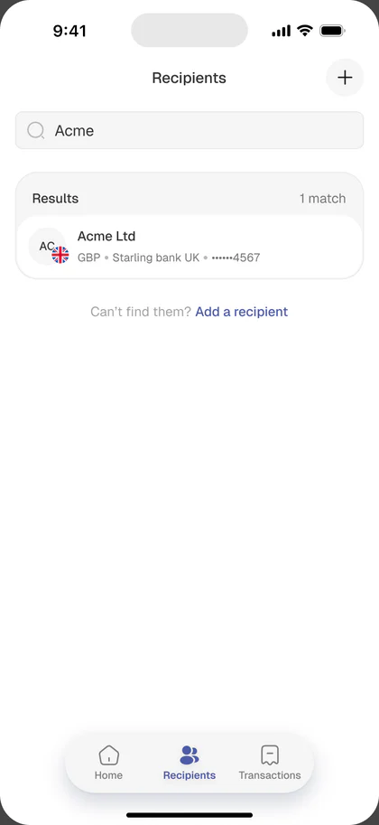
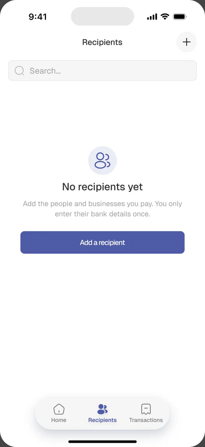
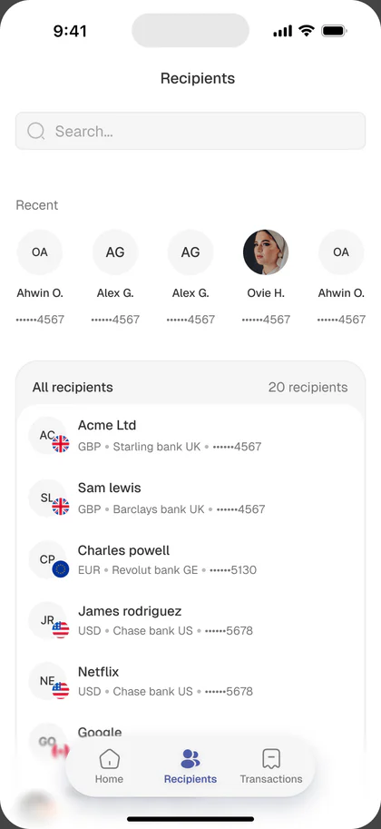
Business users pay the same 10 to 30 counterparties every month. The old app treated recipients as a flat address book. The redesign treats them as the second-most-used surface after Send Money.
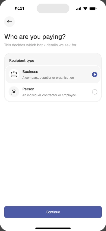
- Business / Individual tags on every row so a bookkeeper can scan quickly
- Country flag and bank inline, so there’s no drilling in just to remember which USD account is which
- Last payment inline (“Last: £2,300 · 3 days ago”), which makes repeat sends one tap
- Recent row at the top for the most frequent counterparties
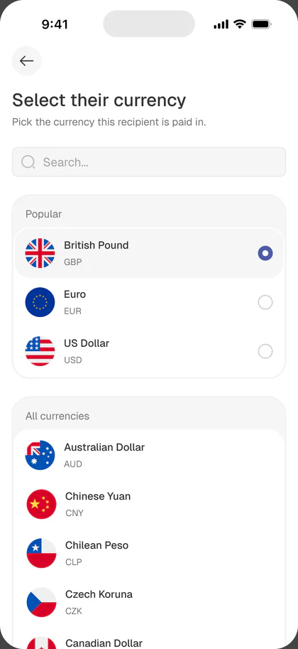
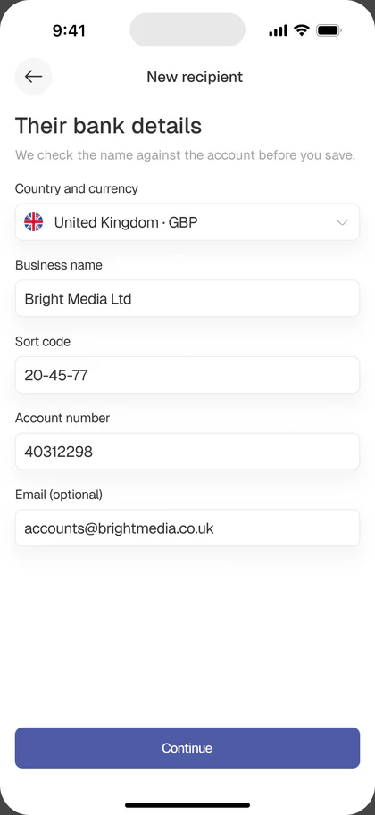
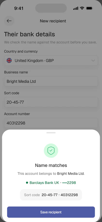
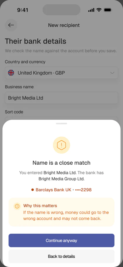
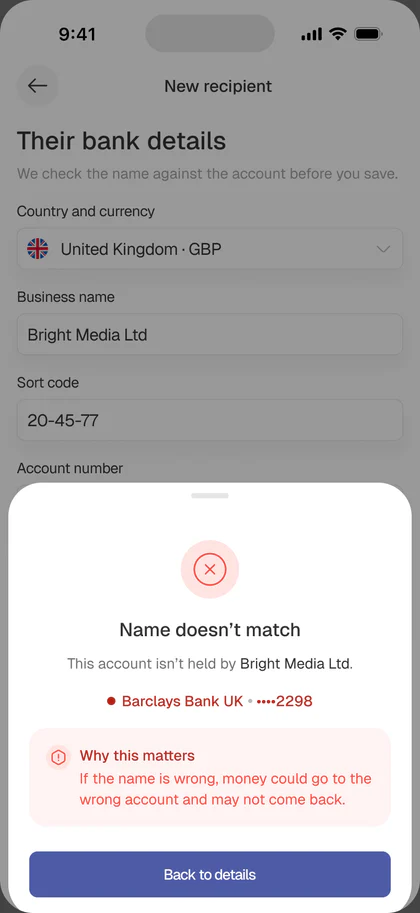
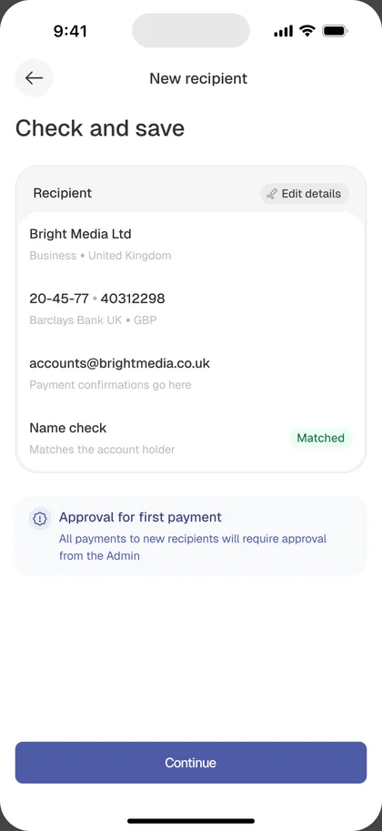
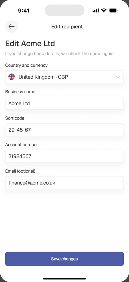
- Add recipient split into three short steps: identity → bank details → review
The review step before saving is the smallest decision in this whole case study, but the one that will save the most money. Recipients entered wrong are the most common cause of failed international transfers.
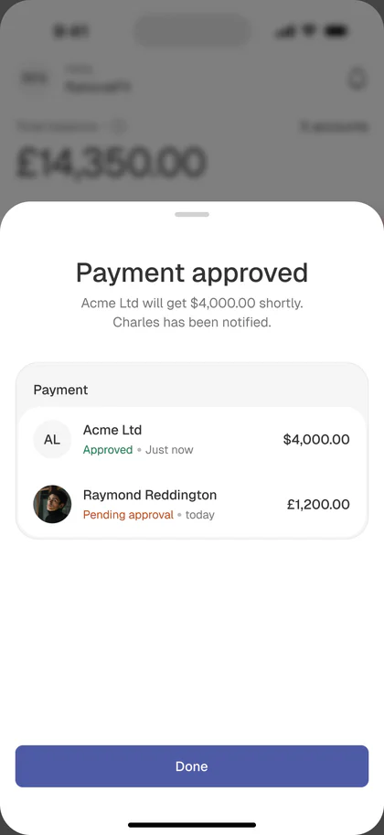
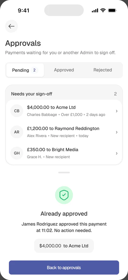
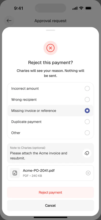
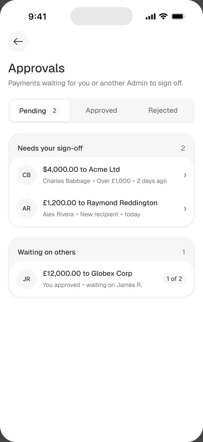
Payment approvals
Approvals only work if they’re quick to act on.
A team member creates the payment, and the approver reviews it from the push notification or the Pending band on the dashboard. Everything needed to decide sits on one screen, and the payment can be approved, rejected, or sent back with a request for changes.
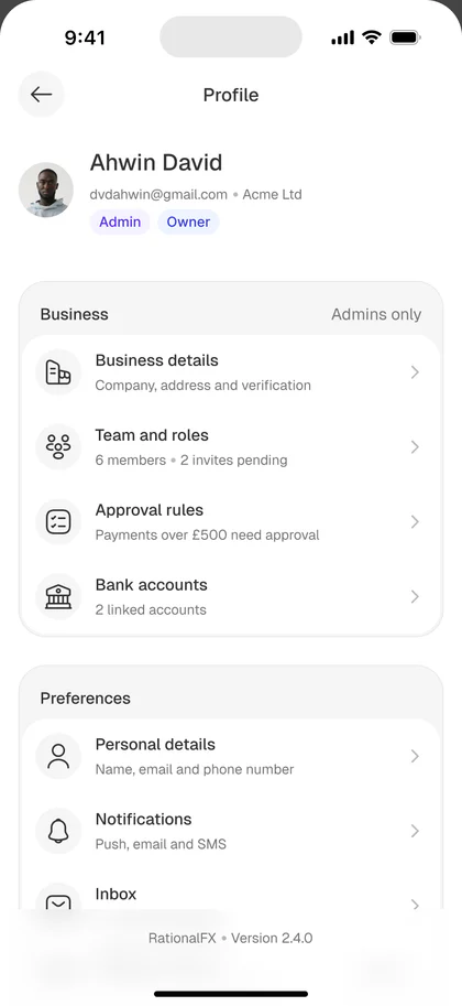
The profile
Redesigned as business identity
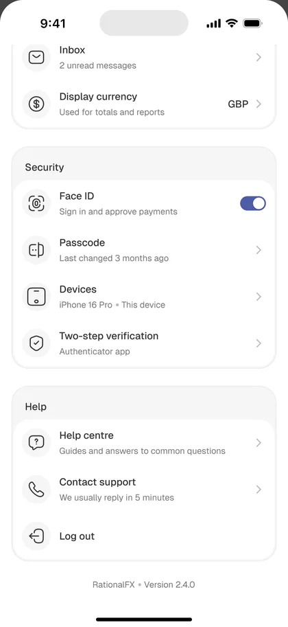
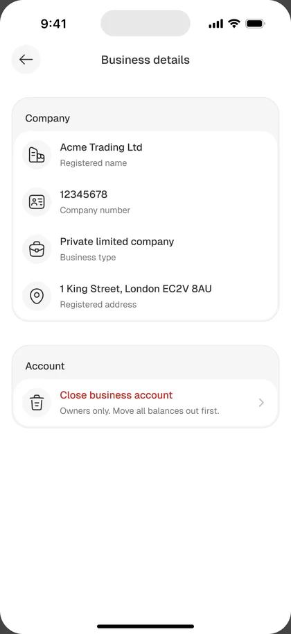
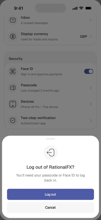
The old profile was a settings list. The new one shows who you are and what your business can do inside the app:
- Business name and role (Owner / Admin / Member) visible under the avatar
- KYB verification status
- Entries for Business details, Team & roles, Approval rules, Payment methods, Documents, Security, Support
- A “Complete your setup” checklist for users who deferred team + approval setup during onboarding
Even in a personal account context this reads as intentional. The profile explains who the user is inside the app, not just their notification preferences.
Design system
From a pattern library to a design system
I started with a small, purpose-built pattern library. The core patterns:
Wallet card · Currency flag chip · Amount input with live rate panel · Send/receive summary card · Recipient row (Business / Individual variants) · Role card · Approval rule preview · Approval decision card · Quick action button · Rate card · Fee breakdown · Review summary · Status pill (Pending / Processing / Sent / Completed / Received / Awaiting approval) · Timeline component · Receipt block · KYB progress bar
A single radius scale (8 / 16 / pill) and a single avatar rule (circles for people and currencies, rounded squares for brands and apps) keep the patterns consistent across every screen.
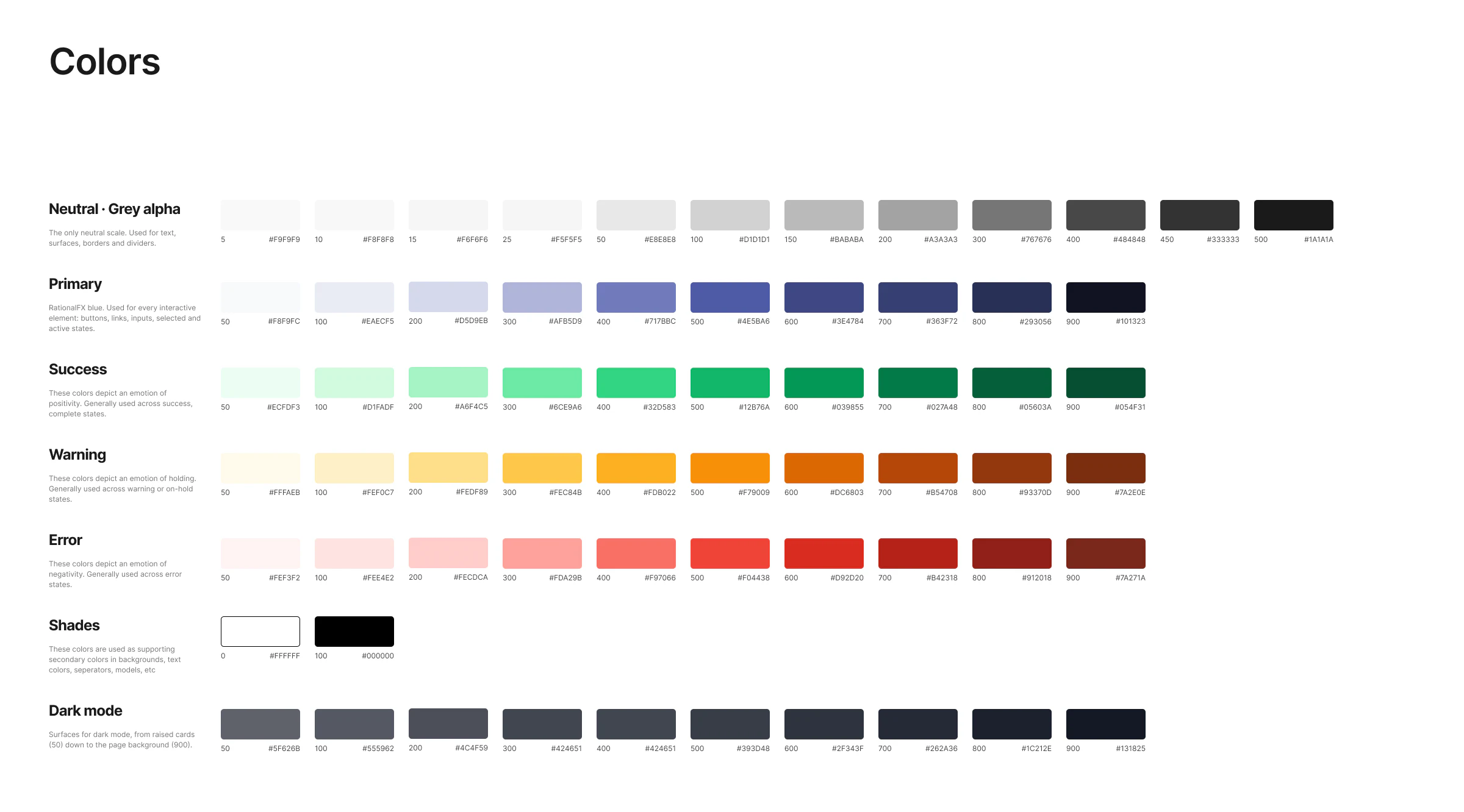
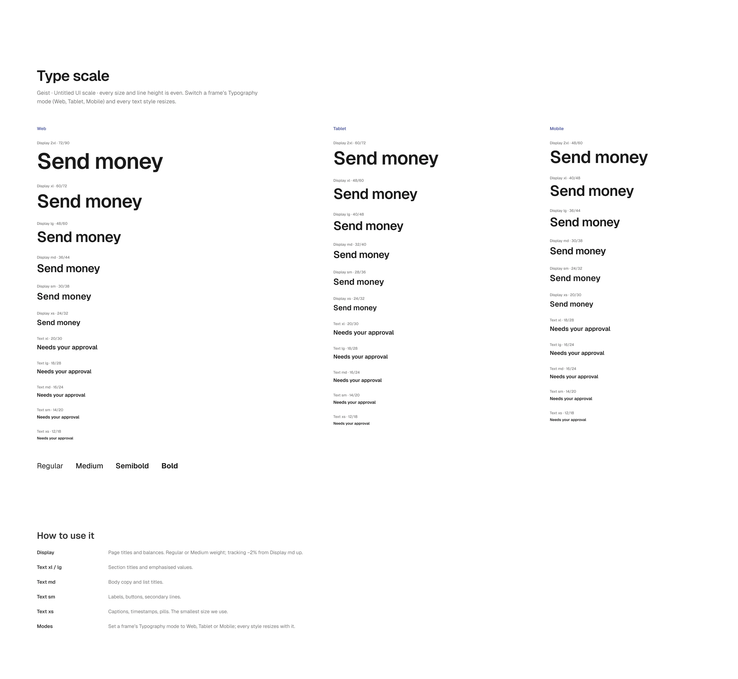
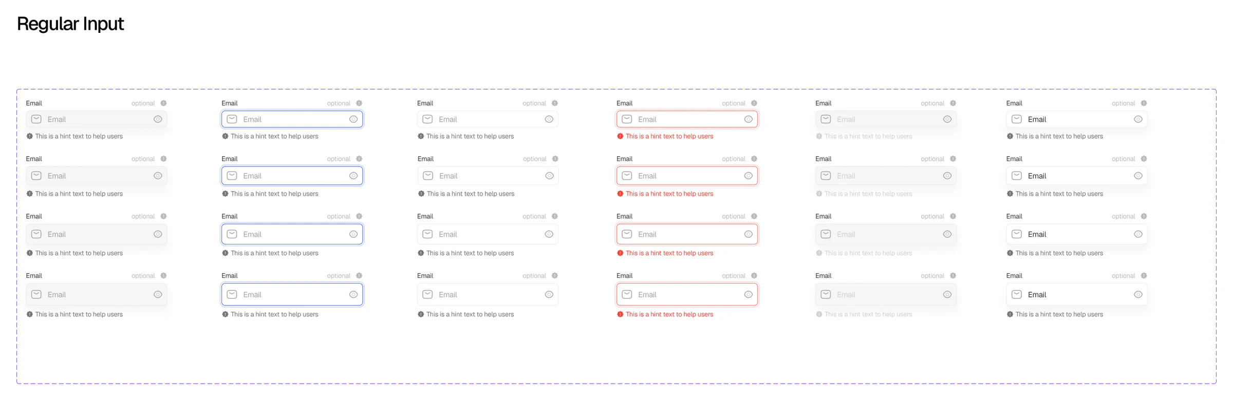
From there it progressively grew into the foundations of a design system. I ran breakdown workshops with developers and other team members, including the sales team, on why a design system mattered, so we would stop creating inconsistent designs.
The foundations everything else is built on: colour, type and the input fields.
Outcomes
The redesign delivers
- A clearer positioning for RationalFX Mobile as a business-first international payments product
- An onboarding flow that establishes account type, business identity, and permission setup in one continuous experience
- Multi-currency wallets as the app’s core primitive, with local account details for receiving payments in native currency
- A send flow with rate, fee, and delivery time surfaced on the amount screen, not hidden until confirmation
- A confirm screen designed around the recipient’s amount as the emotional anchor
- Team, roles, and threshold-based approvals as first-class primitives, so the B2B story finally lands in product
- Recipient management structured for repeat business payments
- A shared pattern library covering every surface the redesign touched
Reflection
What I learned
Brand expression still needs structure.
The lesson from this project was that financial UX isn’t about making flows shorter. It’s about showing the right information at the right moment. Sometimes that means more on screen, not less. The amount screen ended up denser than the old one, and it’s better for it.
Finance does not have to feel cold.
The final direction makes RationalFX Mobile feel more like the tool it actually is: a way for businesses to hold and move money across borders with control, visibility, and confidence, while keeping the door open for personal users and for the v2 roadmap that finishes the story.